Making a glass closure brand as clear as possible
ABOUT
Vinolok rebranding and product launch—When a world-renowned producer of glass closures decided to launch a new product range, we helped to create a new product nomenclature, naming of the new products and refreshed the identity, both in verbal and visual aspects. The project culminated with a product launch campaign and events.
SCOPE
Branding strategy
Naming
Verbal identity
Logo facelift
Identity facelift
Product launch campaign
Marketing materials
Event branding
NAMING
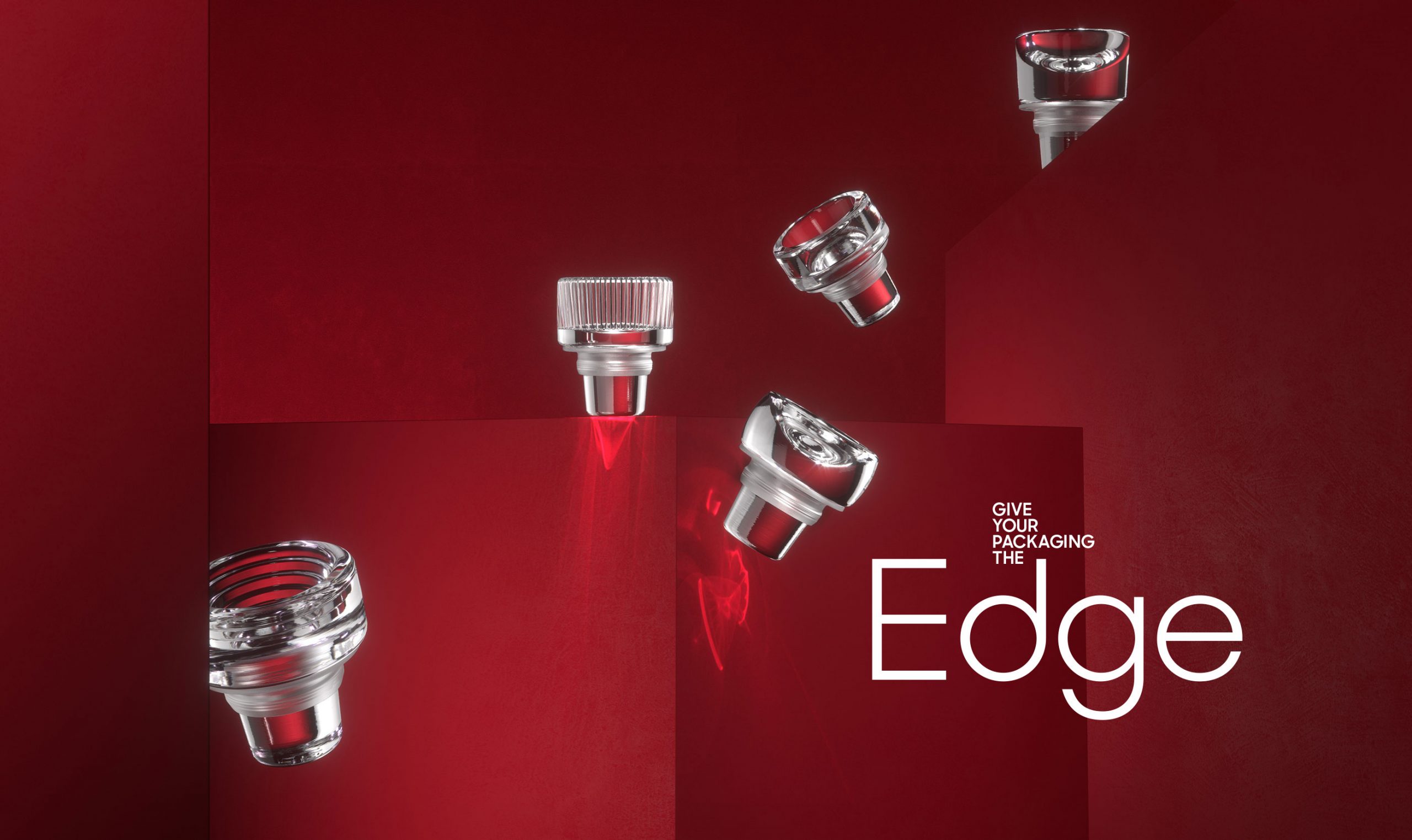
Clarity in the products—With a launch of Vinolok Edge product range, the number of Vinolok products has doubled, rendering the established naming unusable. In a series of workshops with the management, sales and marketing teams we created a three-tier naming structure based on the intended use and price level.

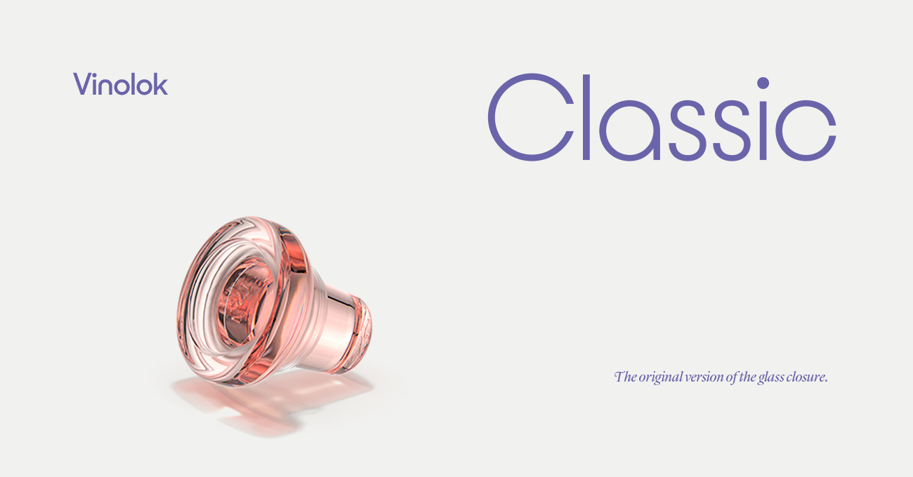
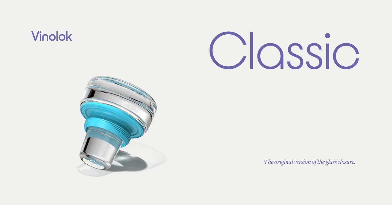


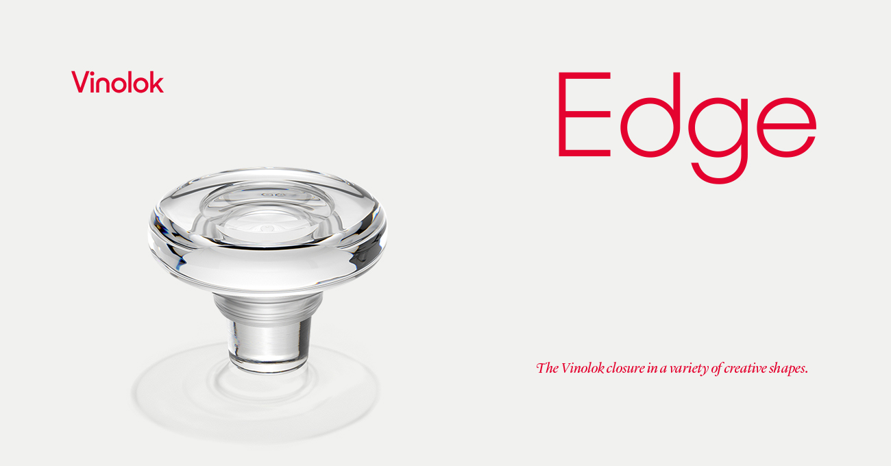

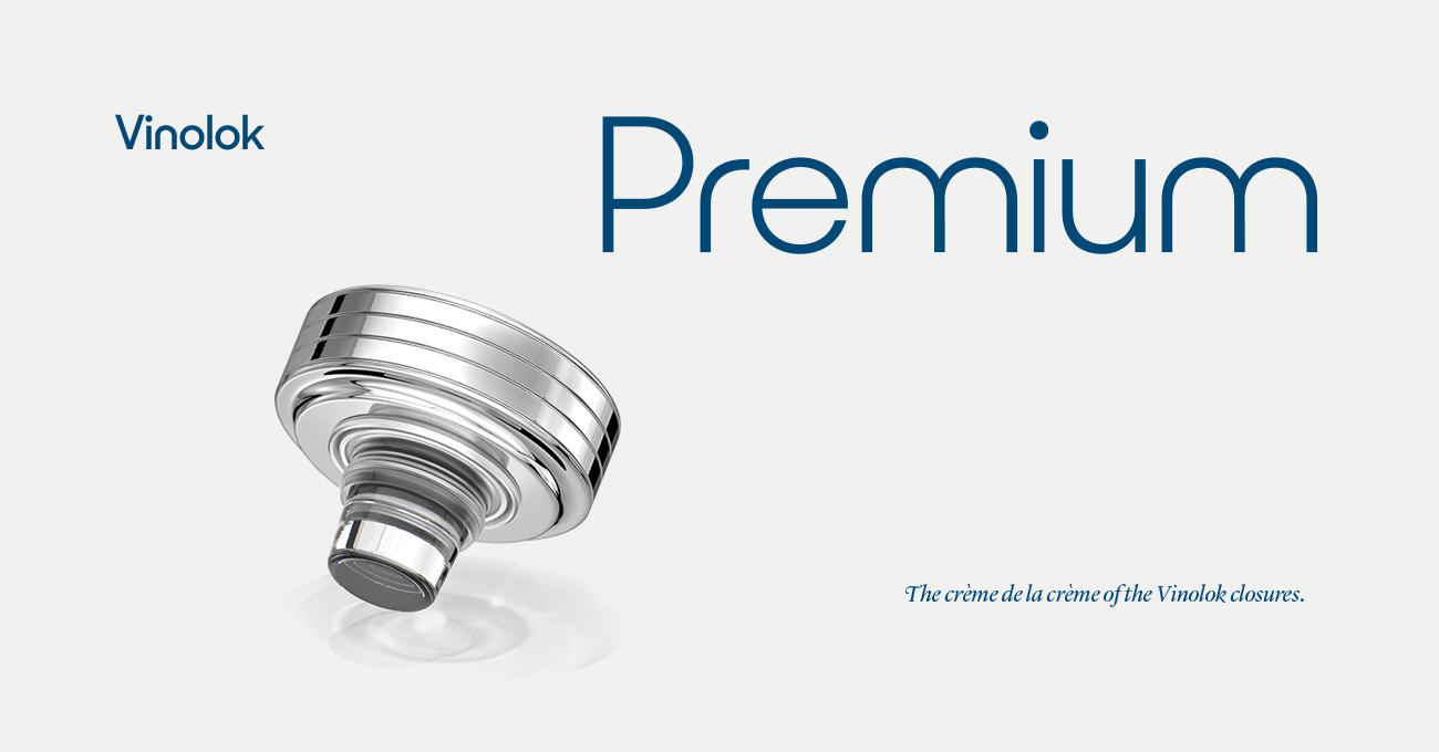


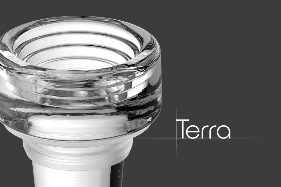


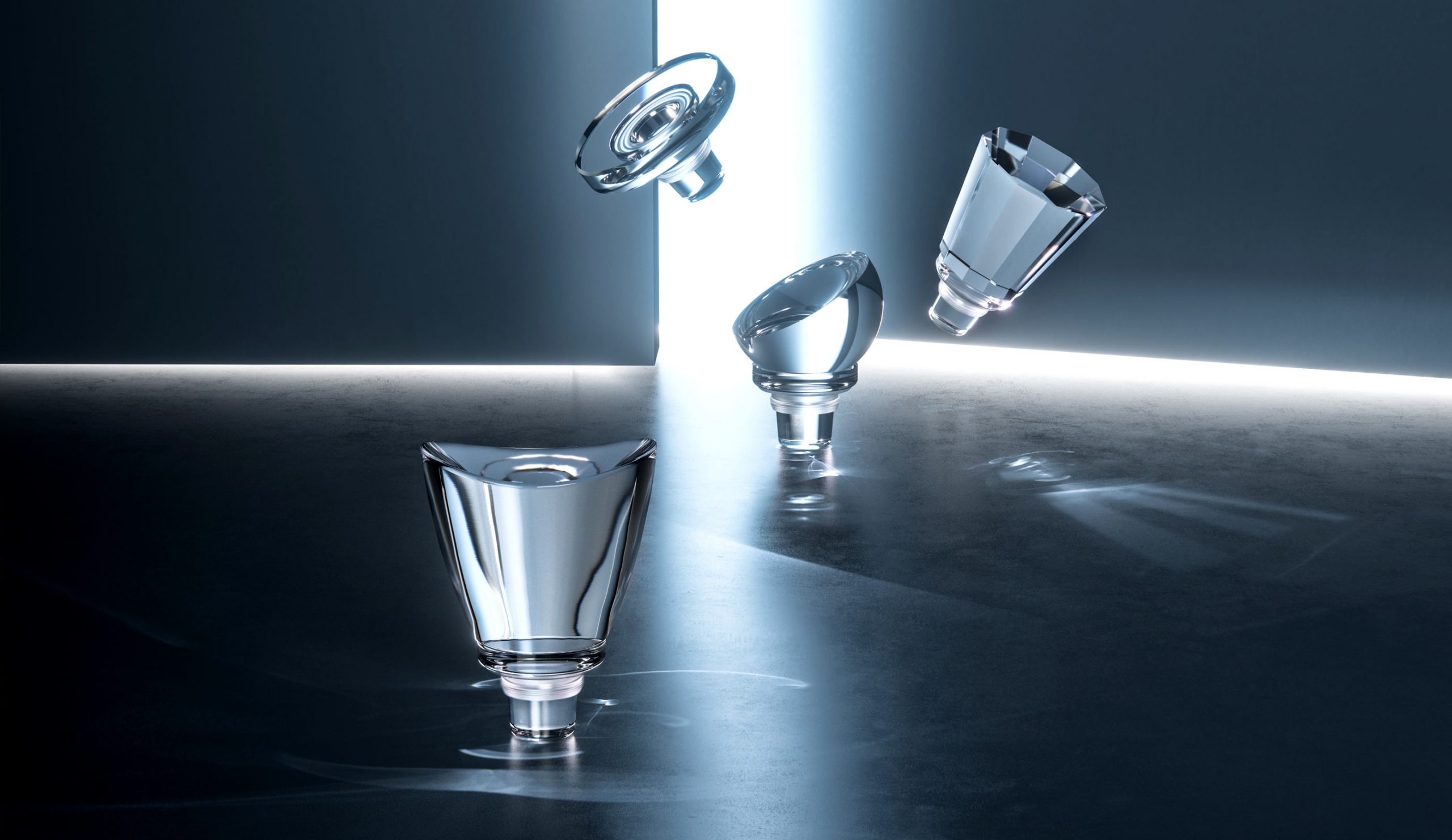
Names developed for the new closures
PRODUCT NAMING
Names that fit—Each of the new products was given a unique name that reflected the product characteristics and intended use. At the same time we also updated the naming of other products to achieve single overarching logic in the product names and established the naming principle for future products.
The new visual and verbal identity
COMMUNICATION
The product launch—Launching the biggest product innovation in Vinolok's history included development of augmented reality app, complete redesign of the website and marketing materials as well as design of an exhibition booth for Luxepack Monaco, a premier show for creative packaging.

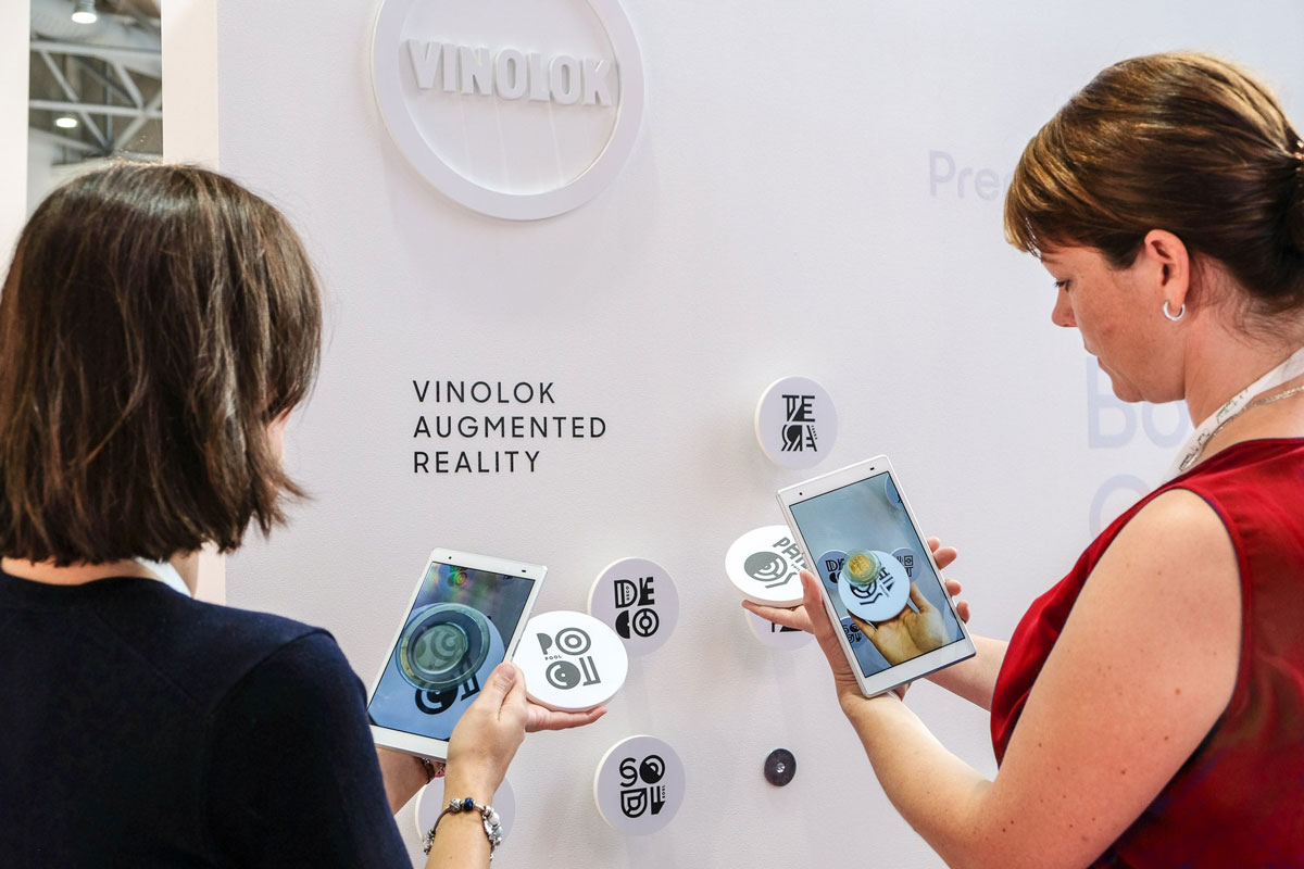
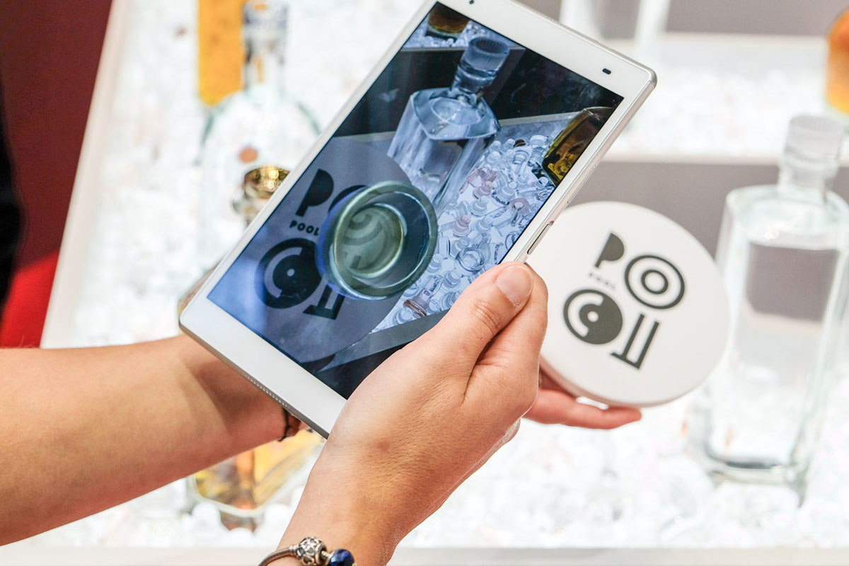
Augmented reality app showed many variations of the product
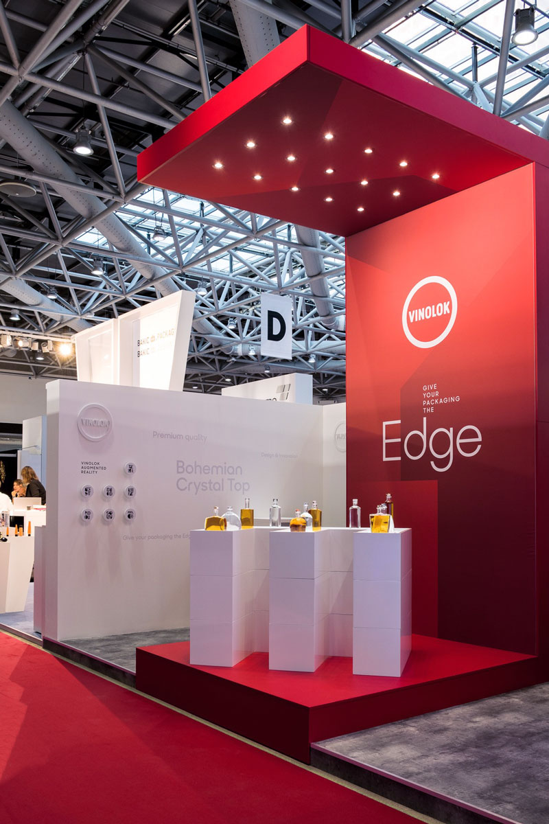
Exhibition stand at Luxepack Monaco
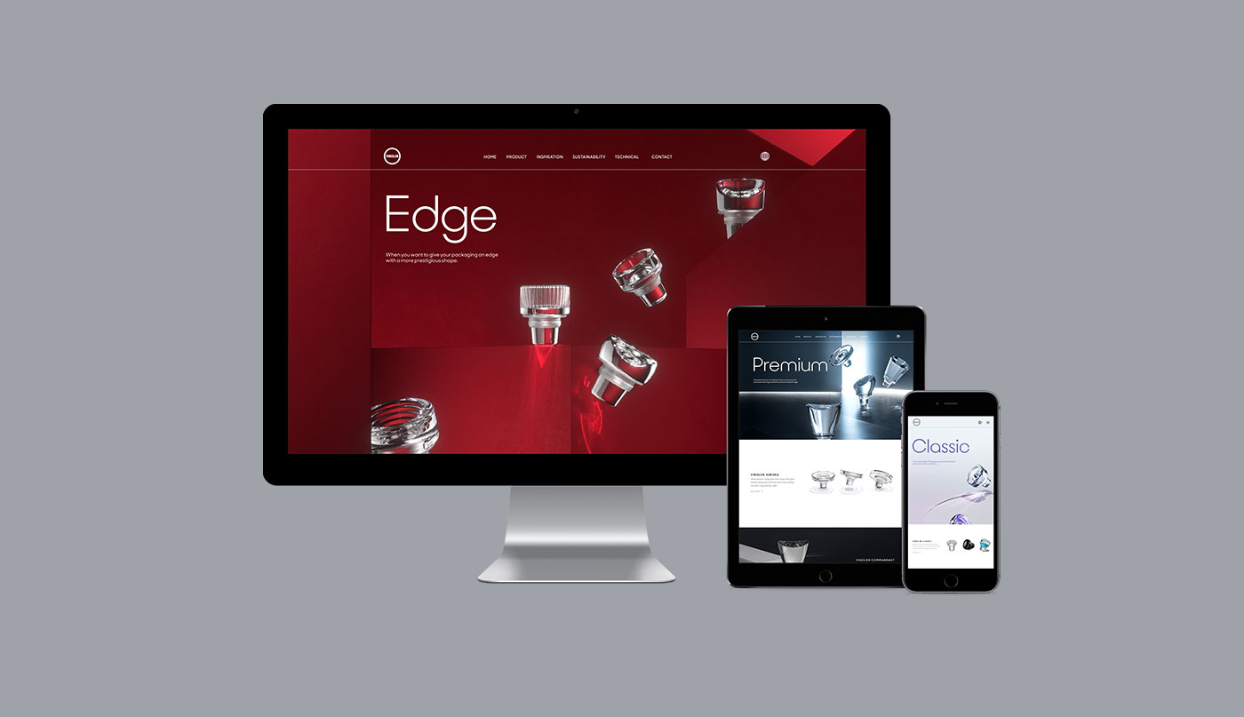
A brand new website with focus on the new product range (visit vinolok.com)
Redesigned printed materials

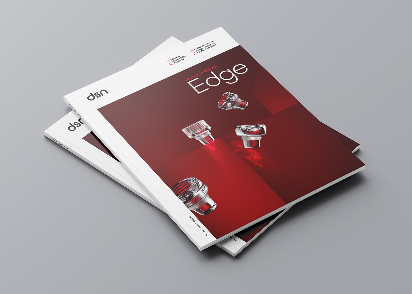
Vinolok magazine for customers


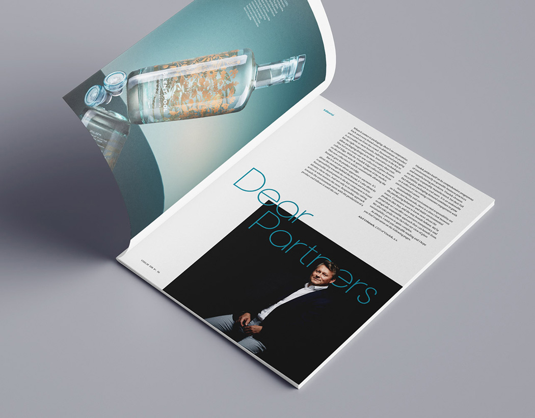
Vinolok magazine spreads

Vinolok brochure
REBRANDING
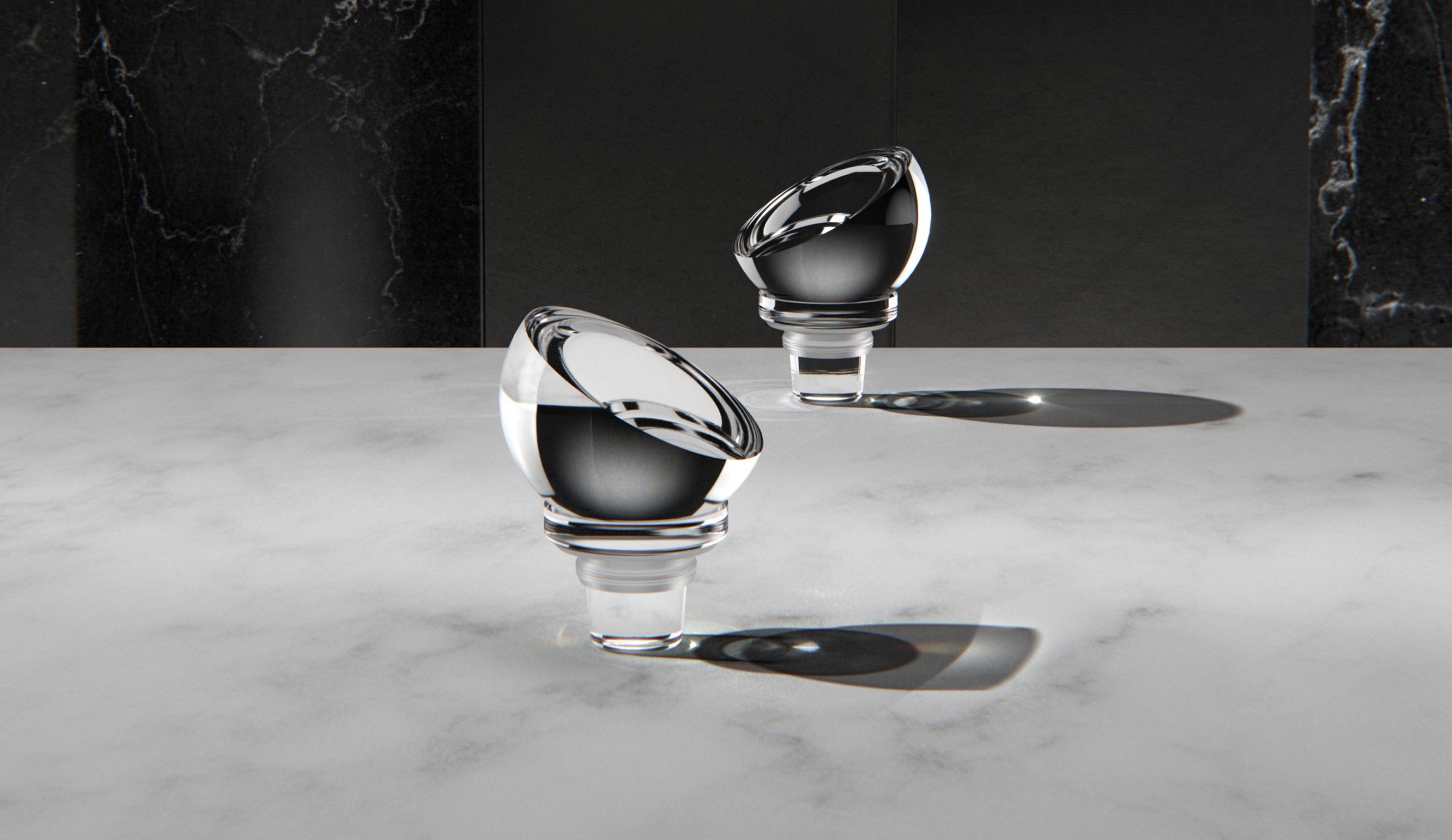
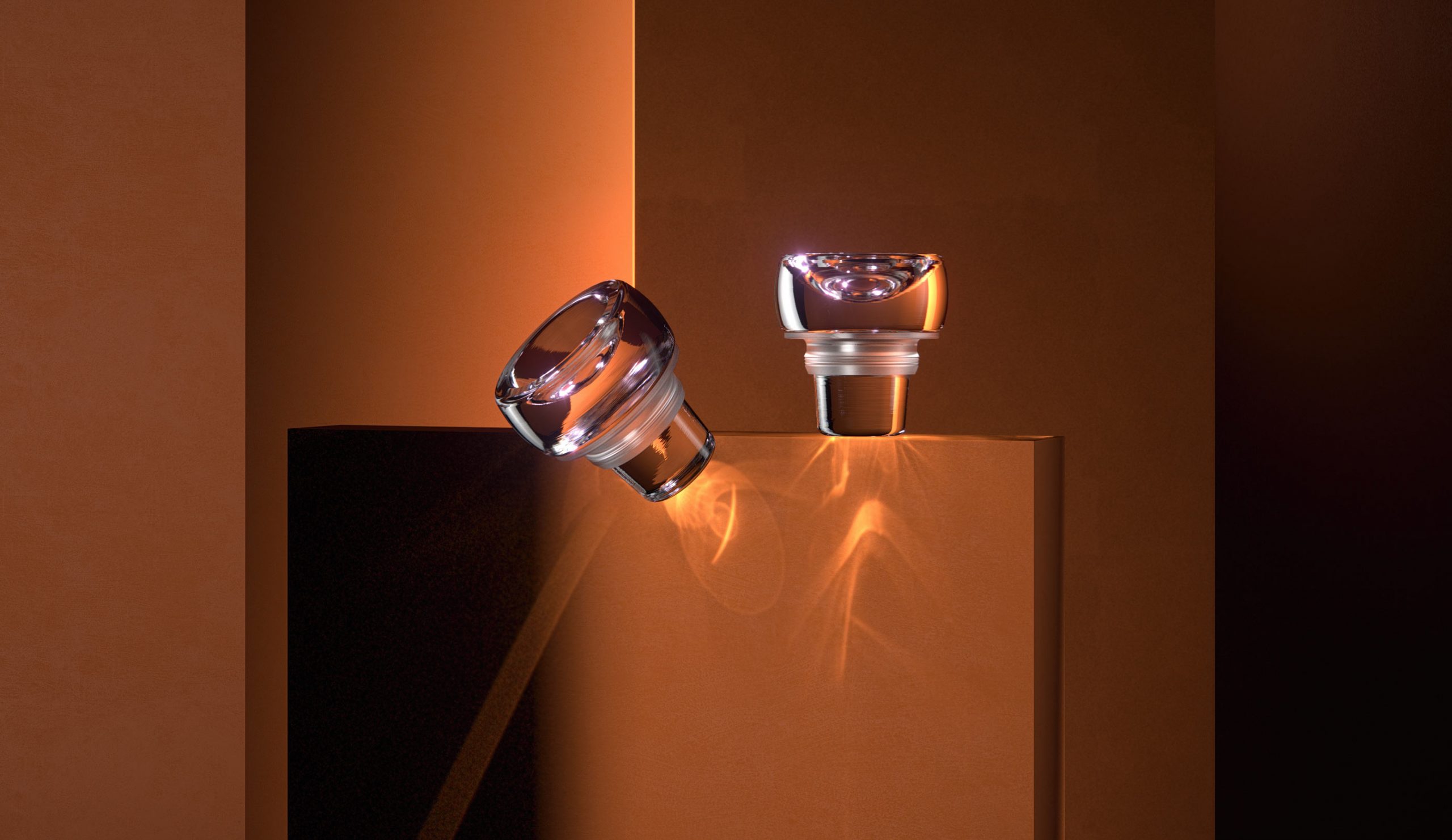
Fine-tuning the look and feel—The brand was originally strongly linked to wine, but the launch of Vinolok Edge marked a new era. The brand entered the premium spirit and water markets and thus needed to refresh their visual identity to reflects the product core values: Unique. Exclusive. Inspiring.
New product visuals became the dominant visual element of the identity


Facelift of the Vinolok logo

The primary corporate typeface allows switching to alternate characters in order to create a more unique typography.

Refreshed corporate colours pallete
If you want to achieve
the full potential of your
brand—get in Touch.
STUDIO
Touch Branding
Drtinova 557/8 (level 1)
150 00 Praha 5 – Anděl
Czech Republic
Show map
CONTACT
New Business
info@touchbranding.com
Job Opportunities
jobs@touchbranding.com