A brand new visual style that keeps all familiar elements in place
ABOUT
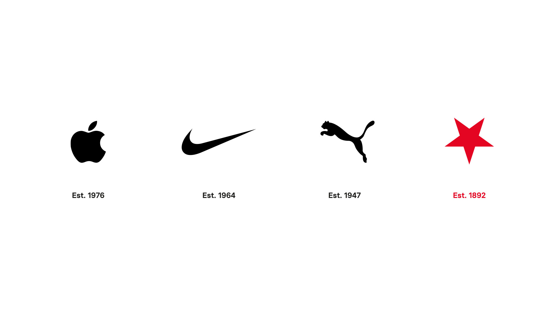
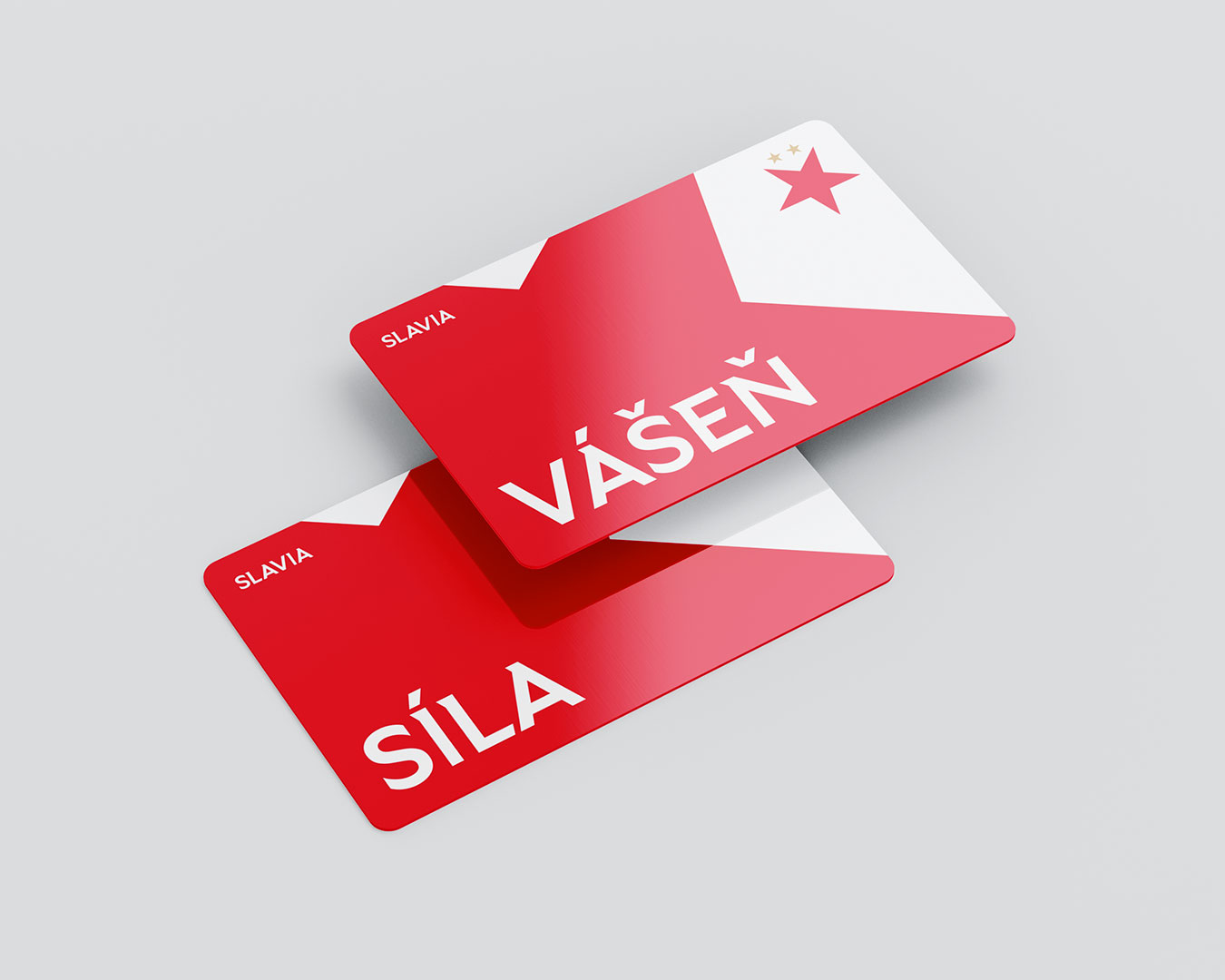
Slavia rebranding—On the occasion of the 130th anniversary of the founding of Slavia, we created a new visual identity of one of the best Czech football teams. By using three of their strongest symbols in a brand new way, we gave Slavia a completely new look while maintaining familiarity.
SCOPE
Rebranding strategy
Naming consultations
Logo redesign
Visual identity system
Communication style
Social media templates
Electronic documents
Motion design
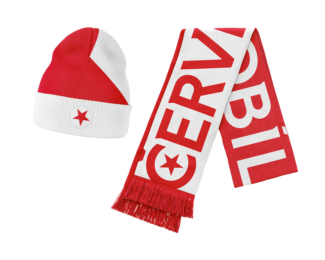
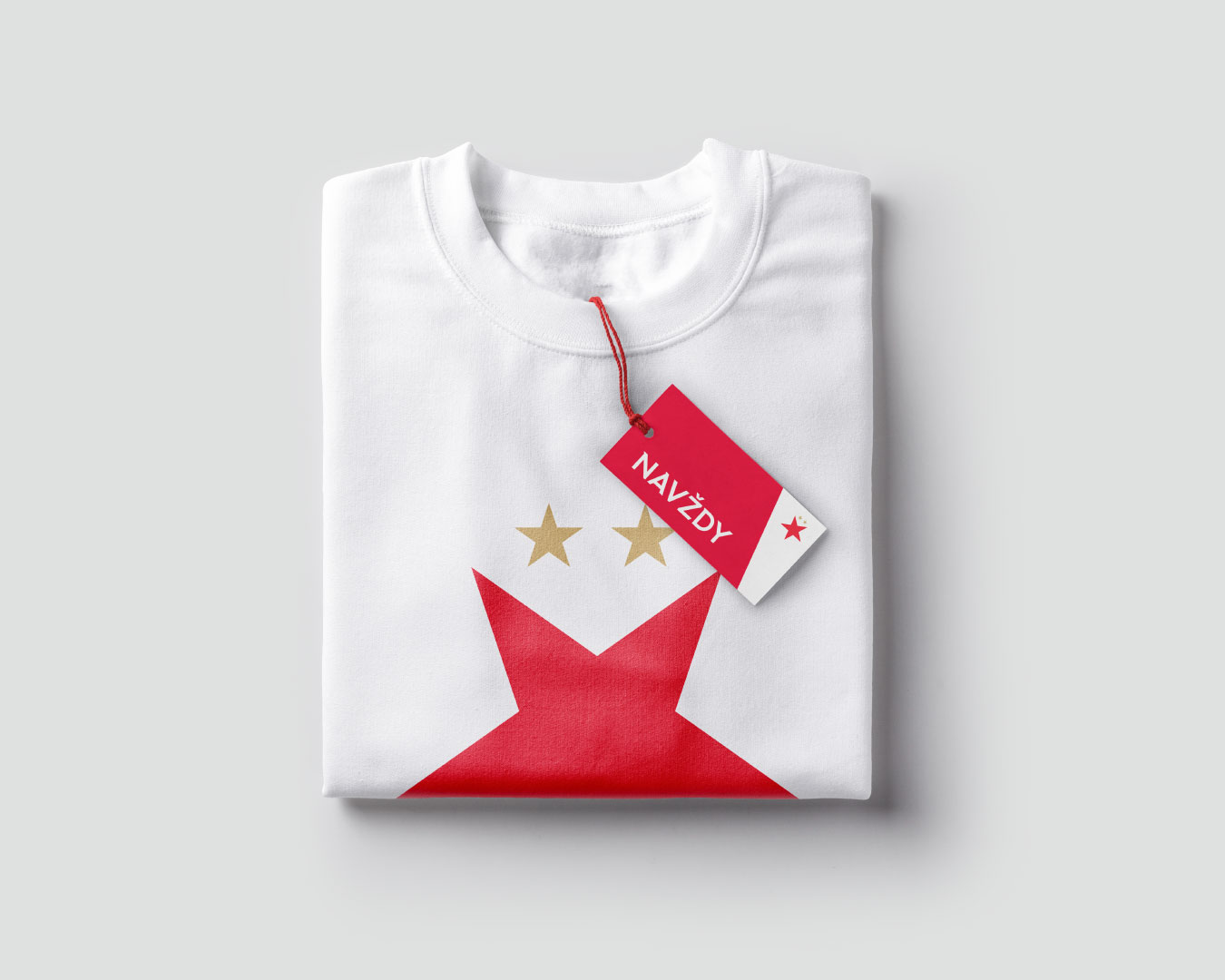
Merchandise
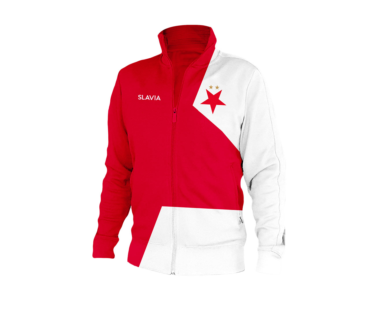
The new Slavia visual identity
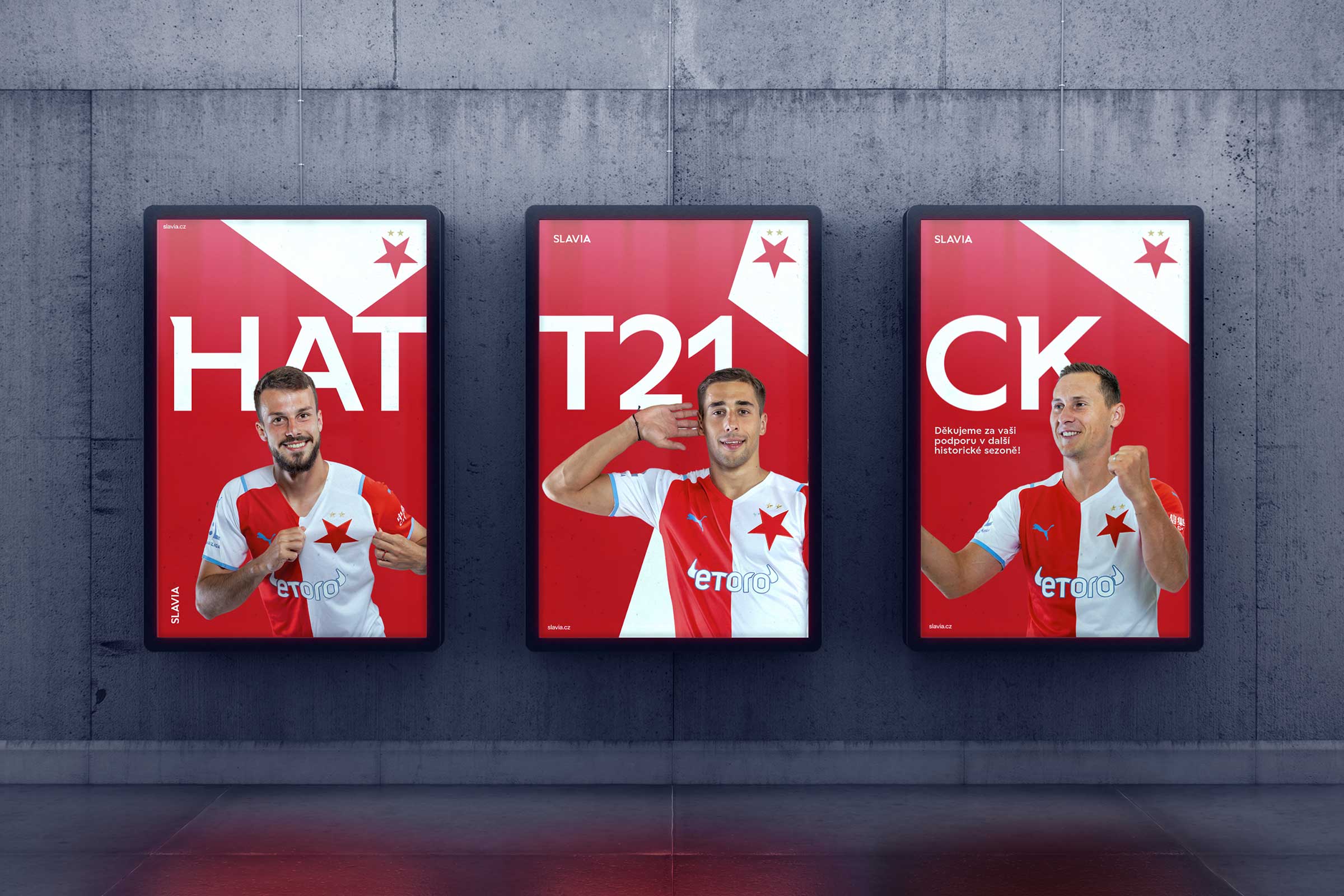
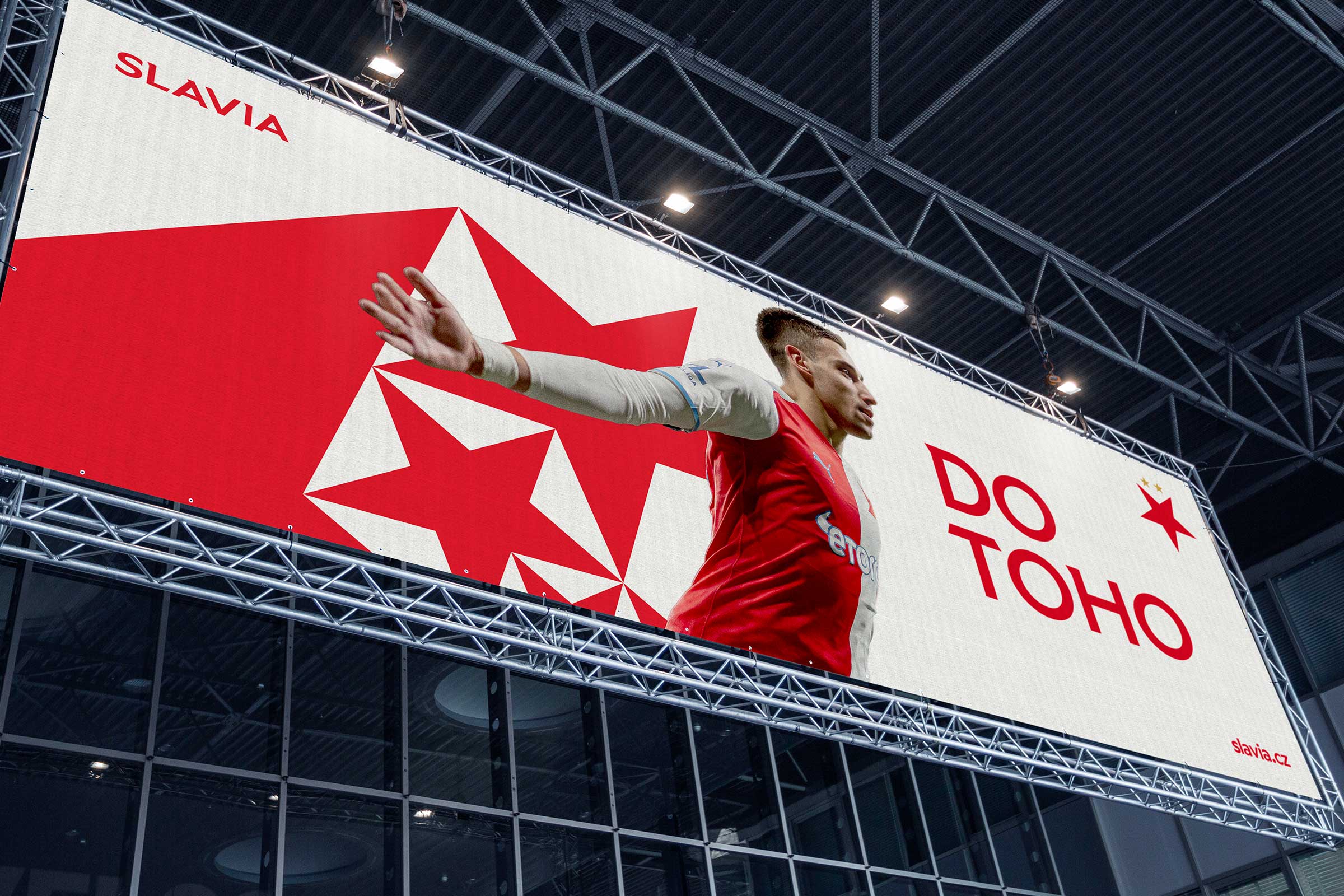
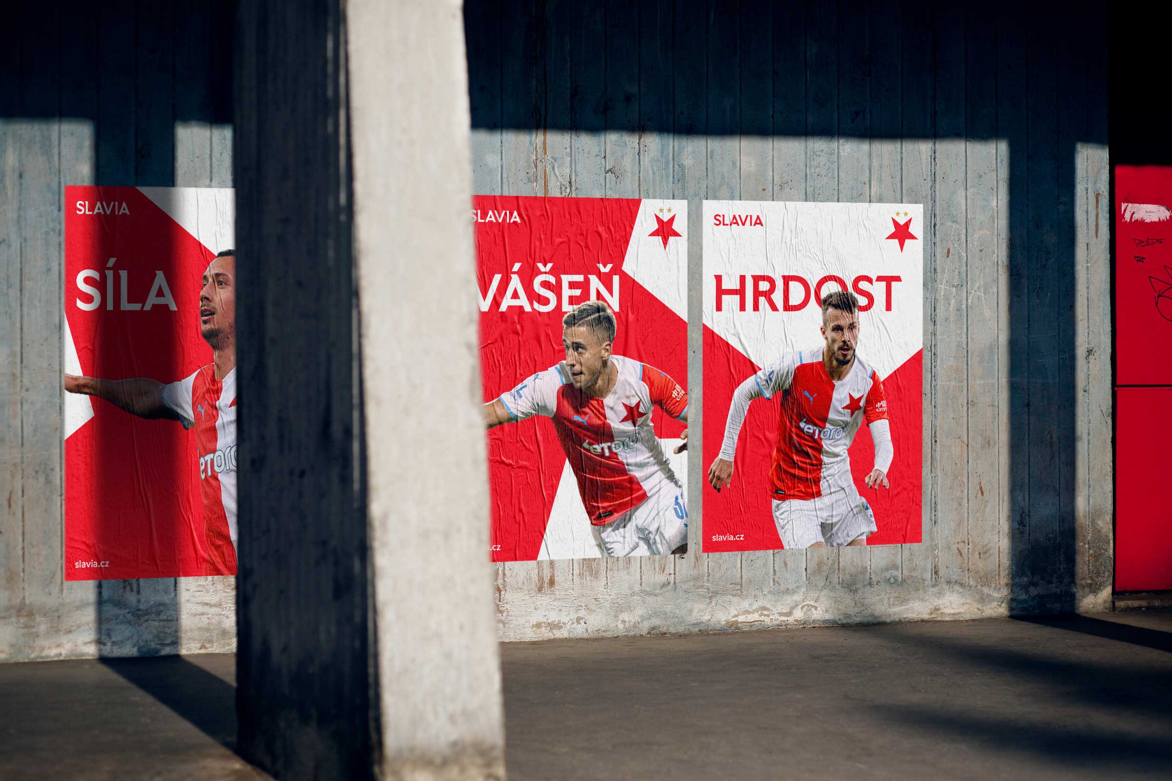
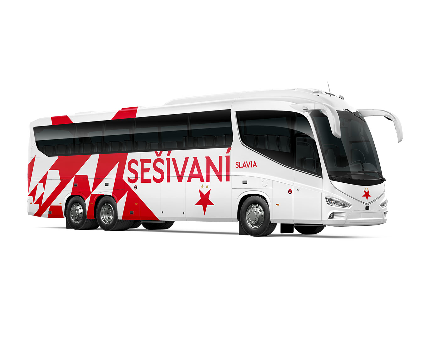
Application of the new Slavia visual identity
Example of identity in motion design
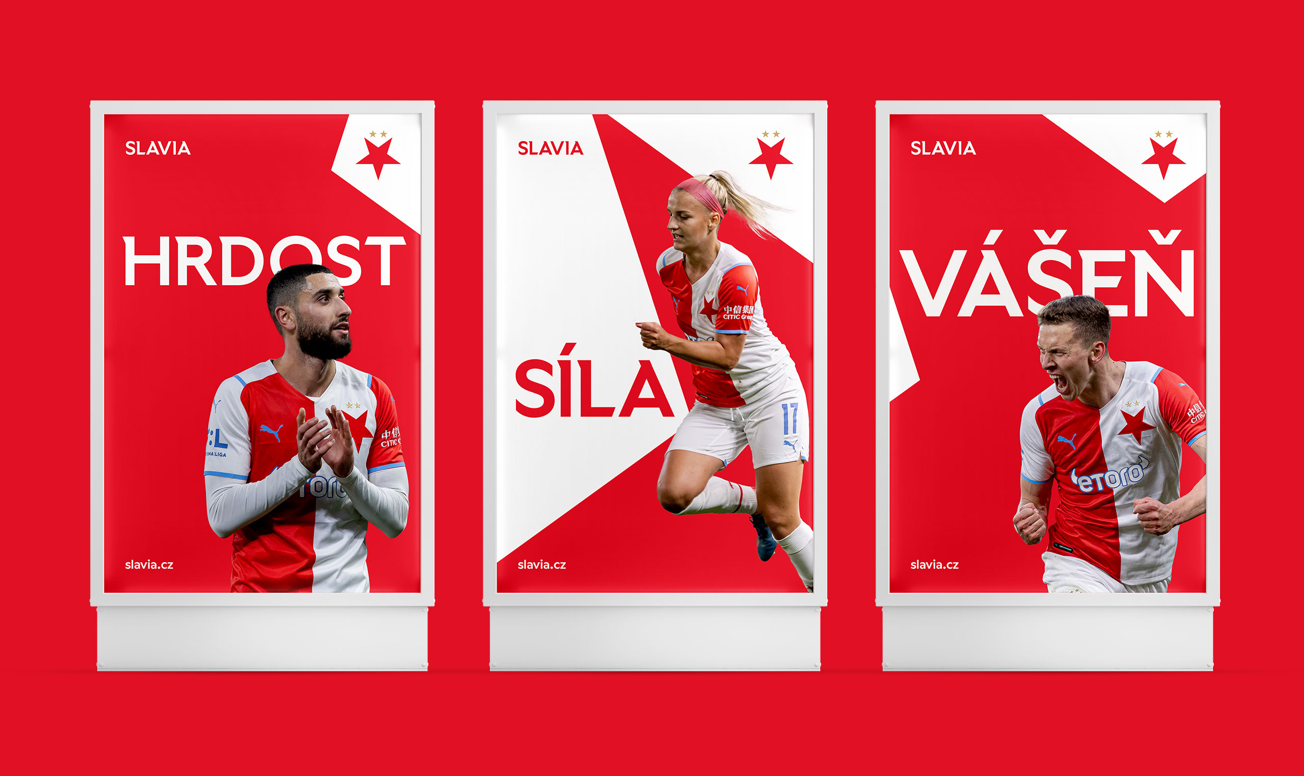
The new identity applied to CLV posters
CONCEPT
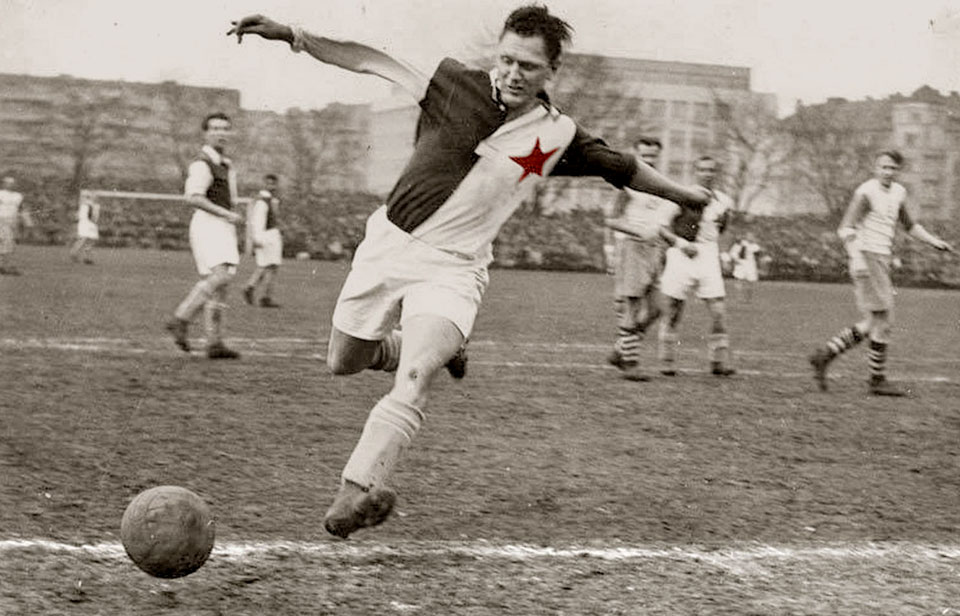
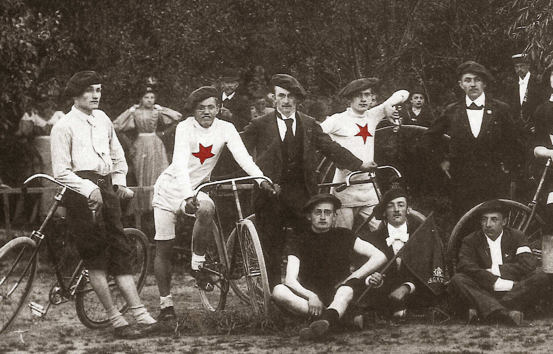
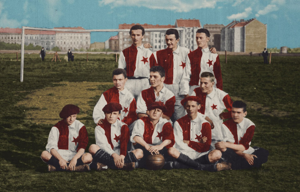
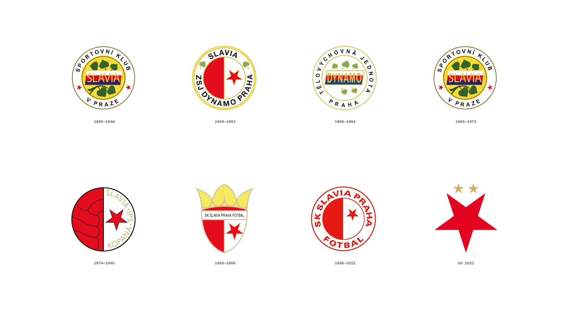
Going back to the roots—The Slavia Sports Club was founded in 1892 with the following words: Our emblem is a red, five-pointed downward star in a white field. Shortly after this the club also agreed on their colours: red and white and they have been faithful to them from the first match until now. Slavia is also known for their unique jerseys, which are sewn together in two parts - red and white. These three are the strongest symbols of the Slavia brand and the new corporate identity builds the entire visual system on them.
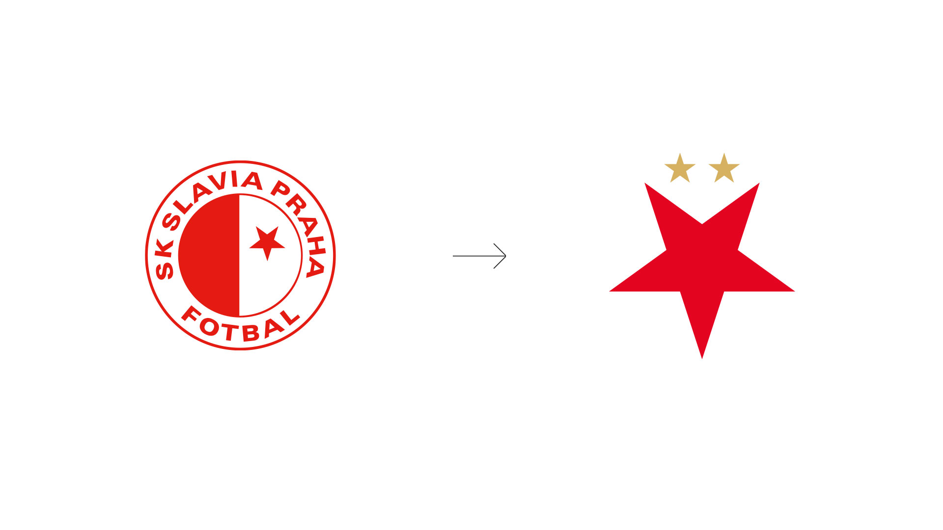
The new Slavia logo
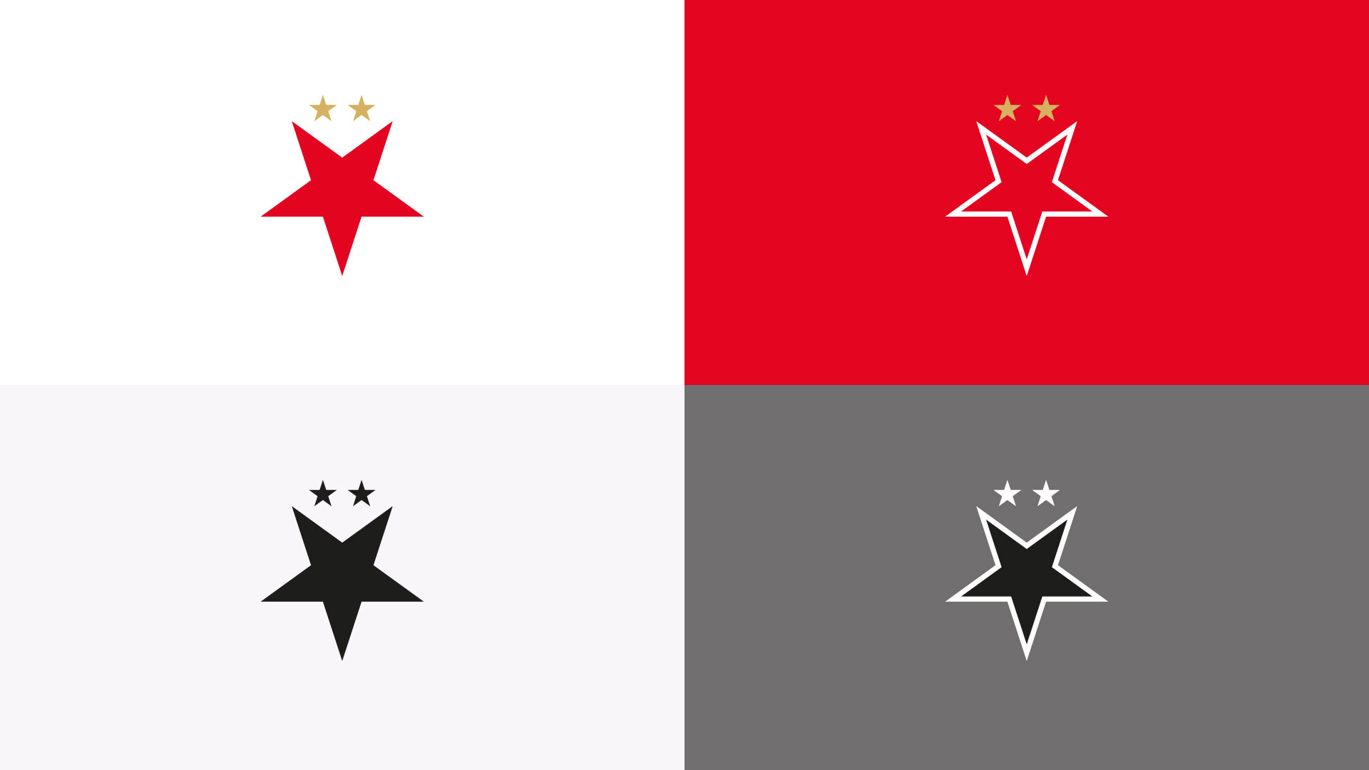
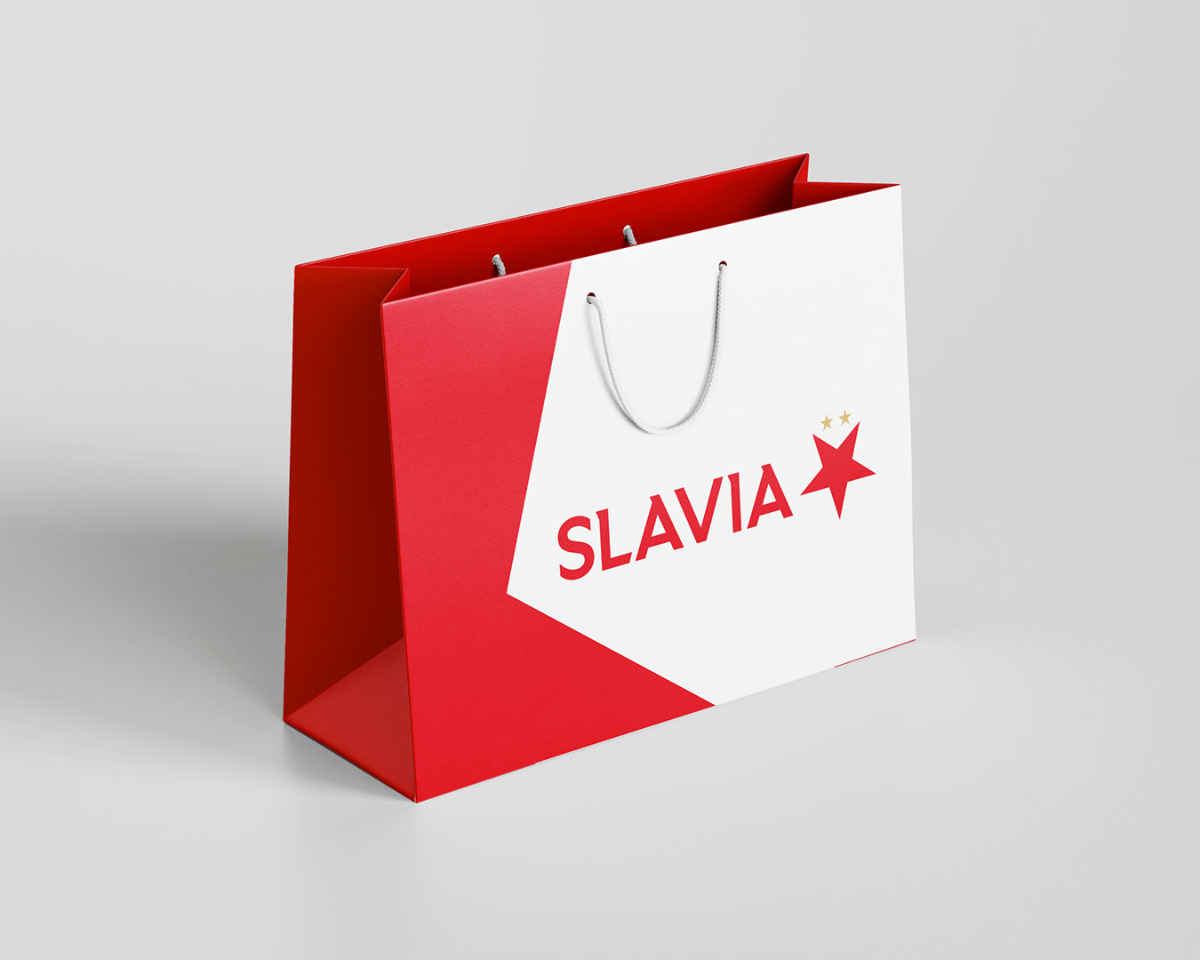
Examples of new logo usage
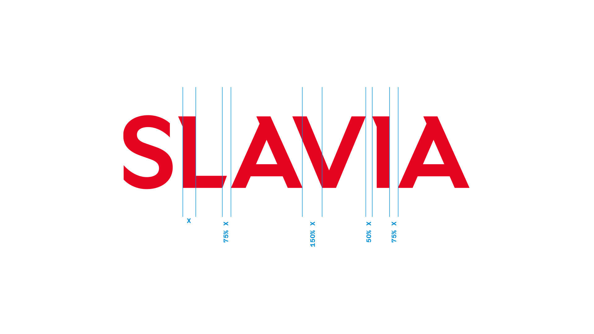
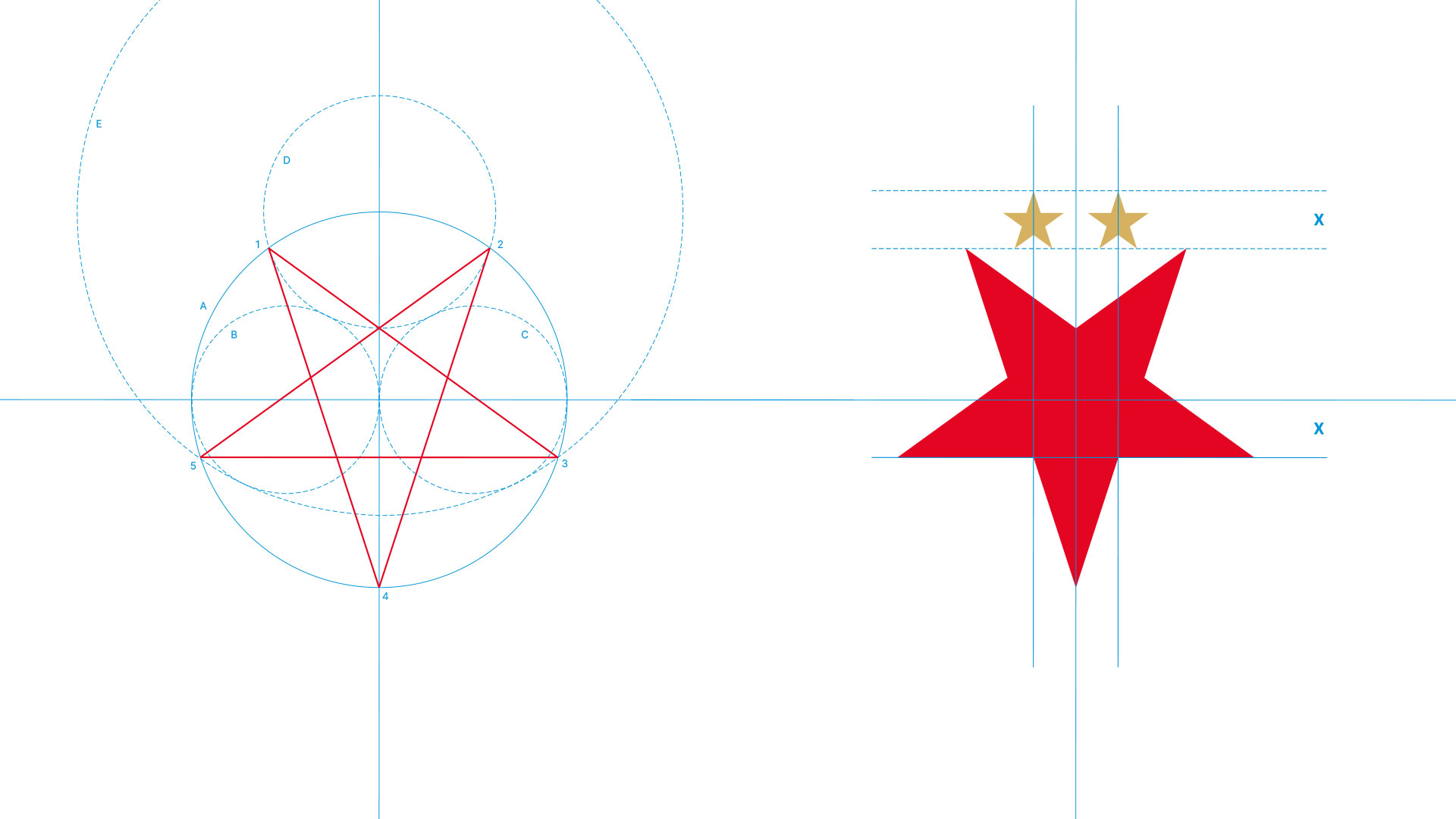
Slavia symbol construction
The club colors dominate all materials, thanks to a well-thought-out system of cutting elements from the logo.
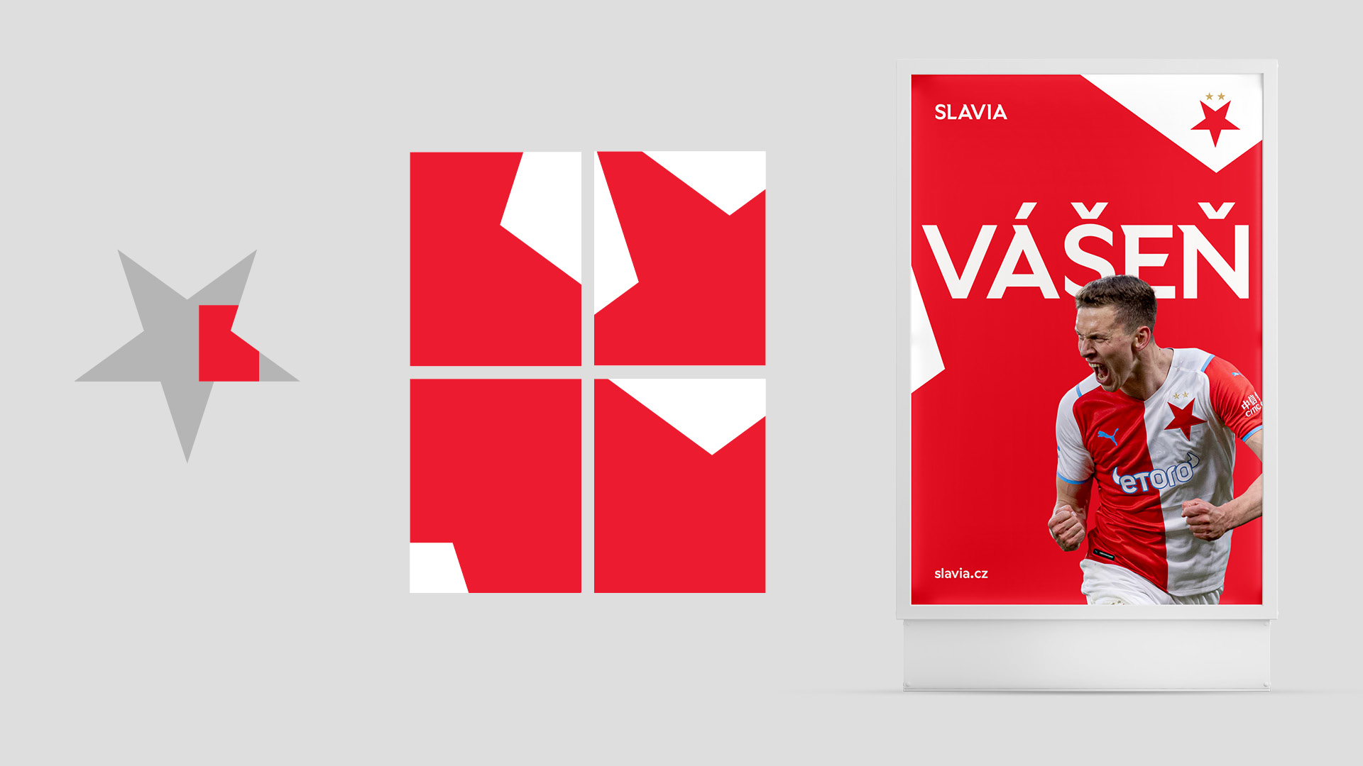
Slavia Headline font is based on Wallop by Displaay Type Foundry. It contains spikes that are shaped like a five-pointed star.
Identity application in motion design
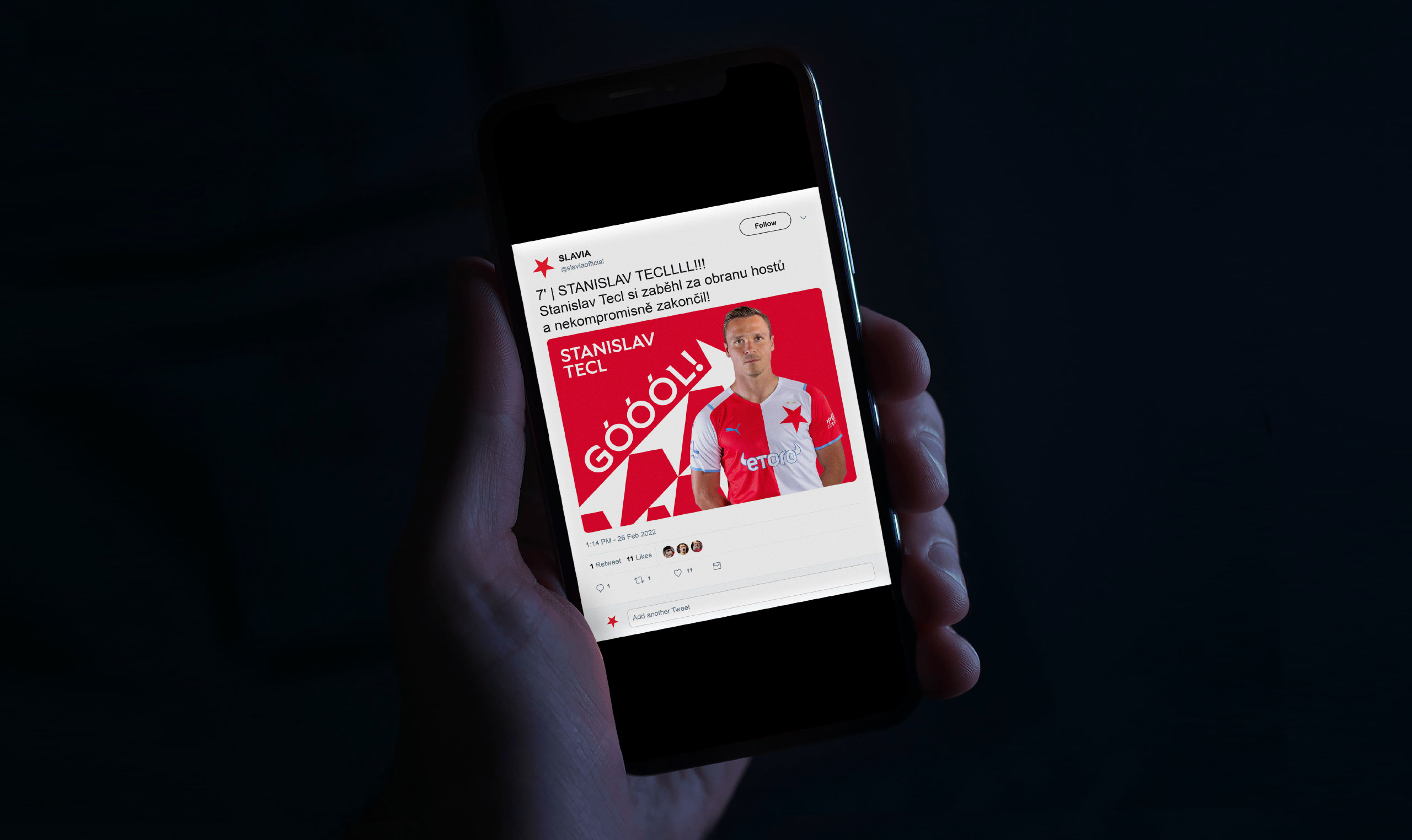
Animation to announce goal, used on social media and on the stadium
MOTION
Emotion via motion—An important element of the new identity is motion design. With social media being the primary communication channel with the fans, we proposed identity elements that allow each post to be a short animated video.
Players staistics in an Instastory format
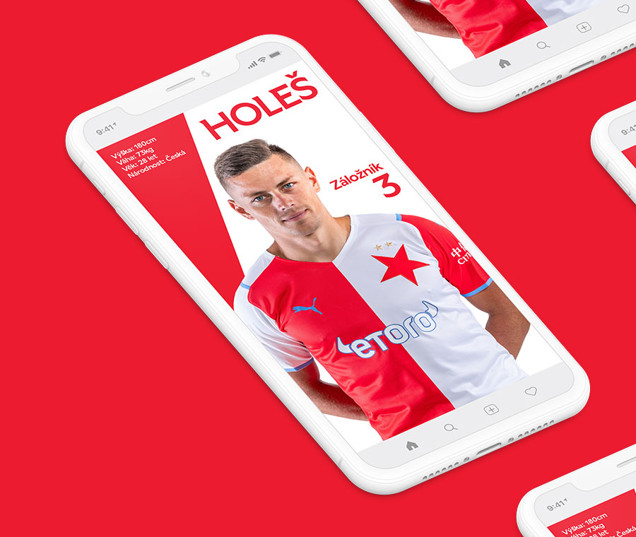
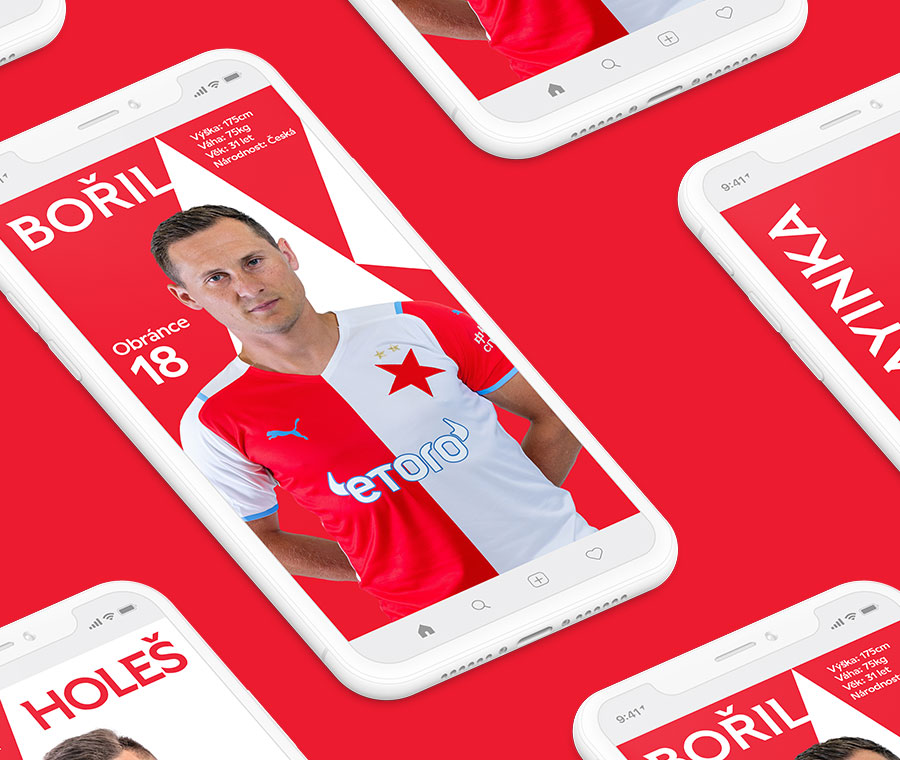
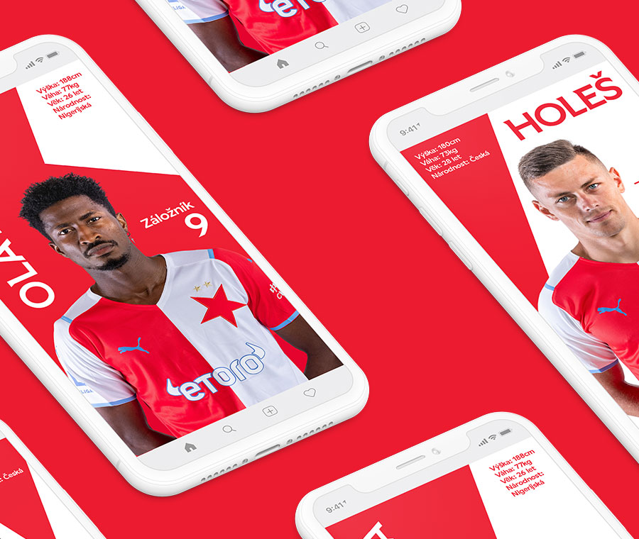
Examples of animated social media posts
EXPANSION
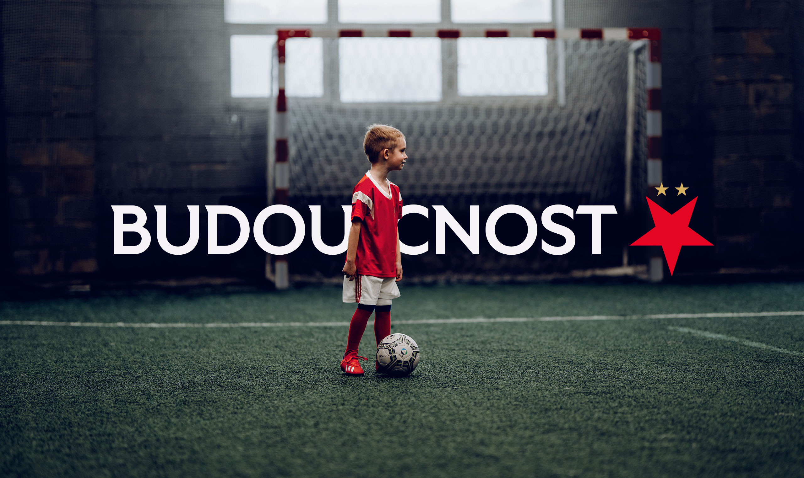
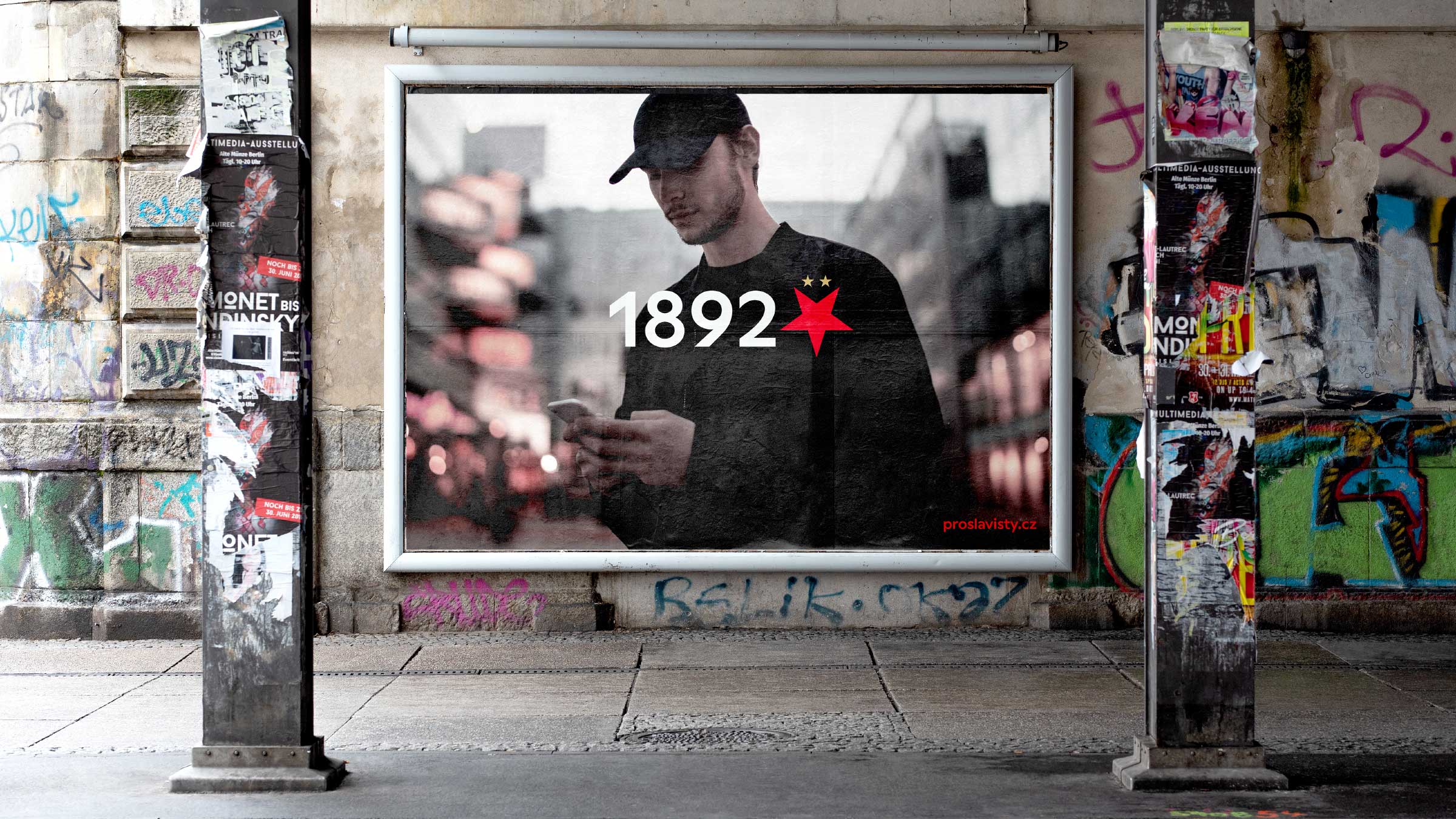
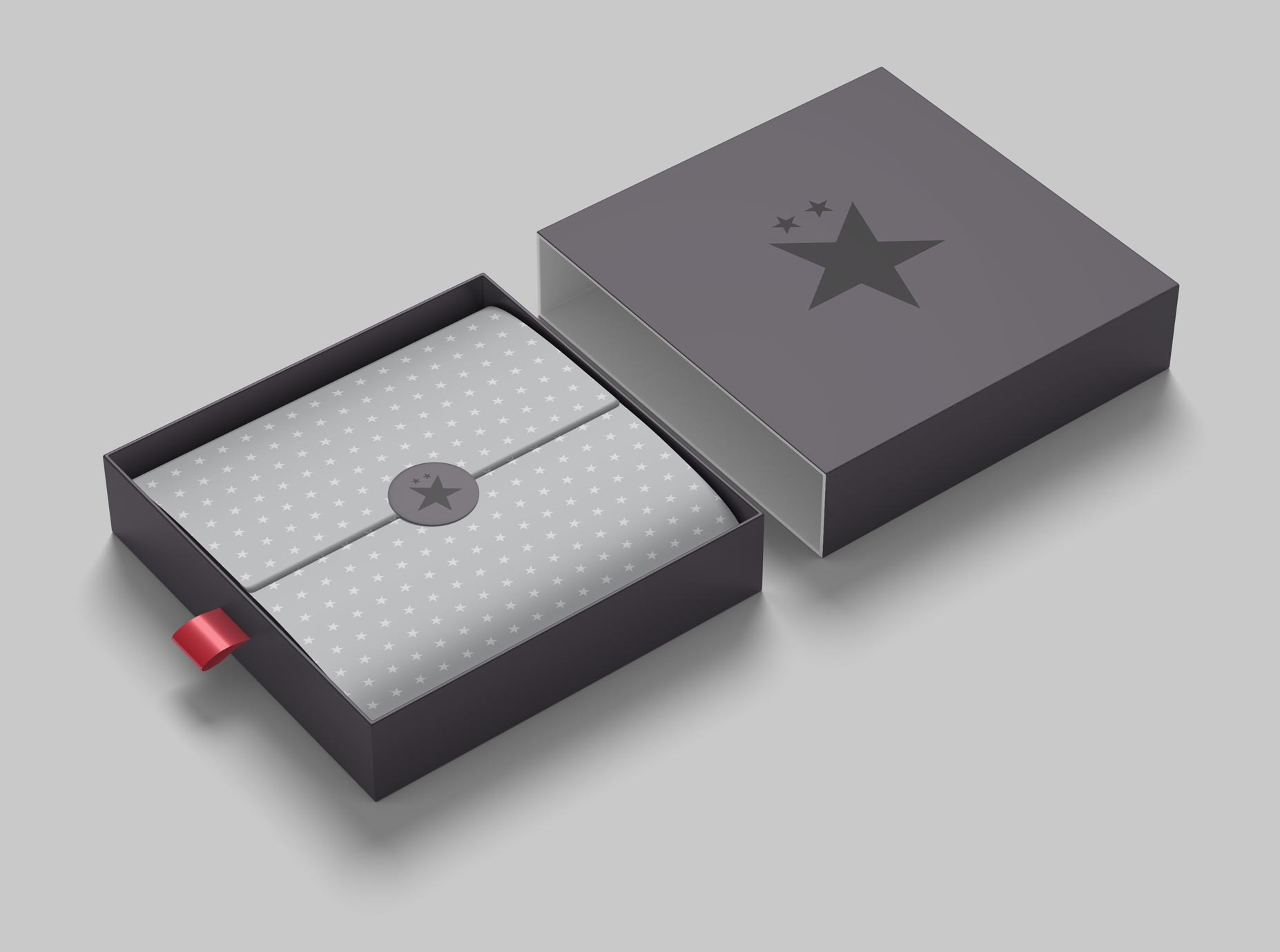
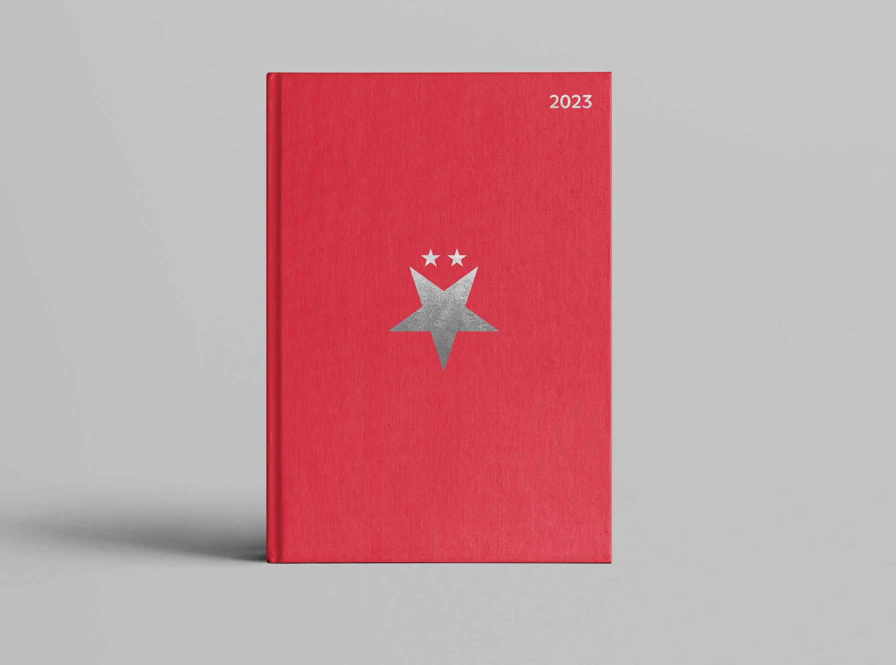
Going beyond—Although Slavia is primarily a sports brand, it gradually expands beyond the main group of die-hard fans. For example, Slavia focuses on the premium market segment or urban fashion. Marketing materials for these sectors differ from the main visual style, eg by using more muted colors or fashion photos.
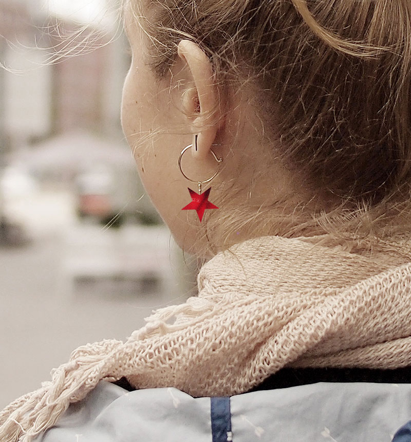
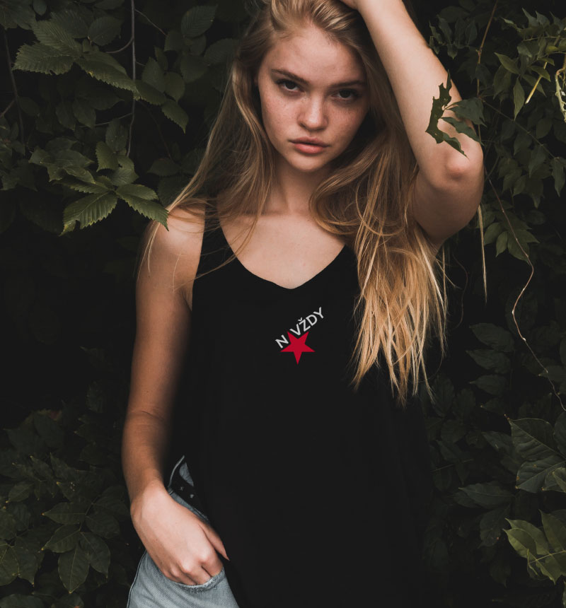
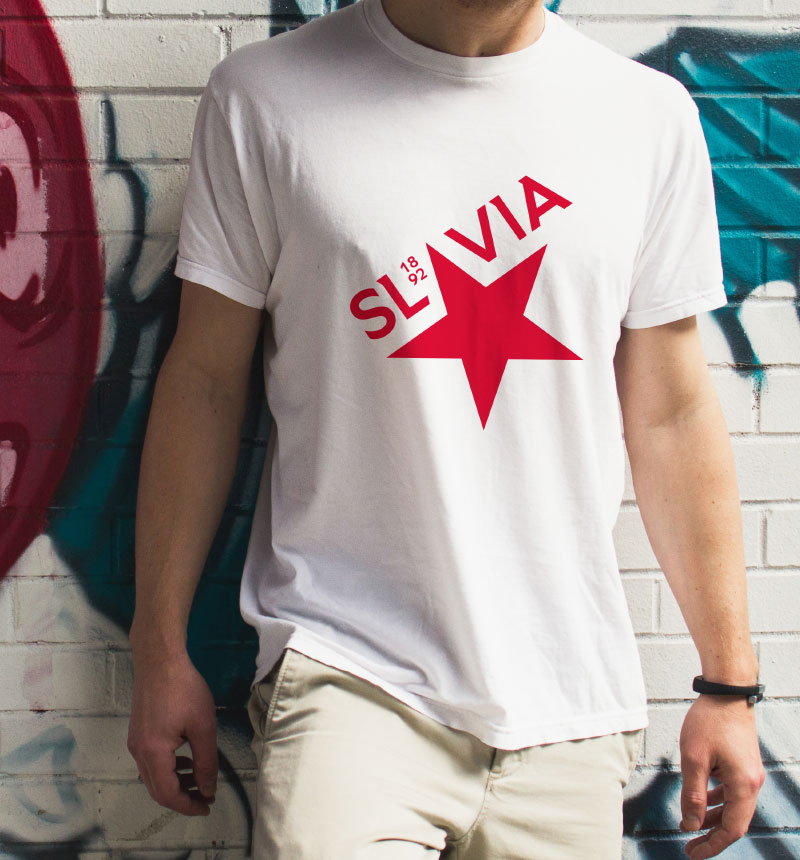
Examples of street fashion communication

Premium branding example
Premium branding example
Concept of merchandise presentation
If you want to achieve
the full potential of your
brand—get in Touch.
STUDIO
Touch Branding
Drtinova 557/8 (level 1)
150 00 Praha 5 – Anděl
Czech Republic
Show map
CONTACT
New Business
info@touchbranding.com
Job Opportunities
jobs@touchbranding.com
