Giving a foundation identity wings to fly with
ABOUT
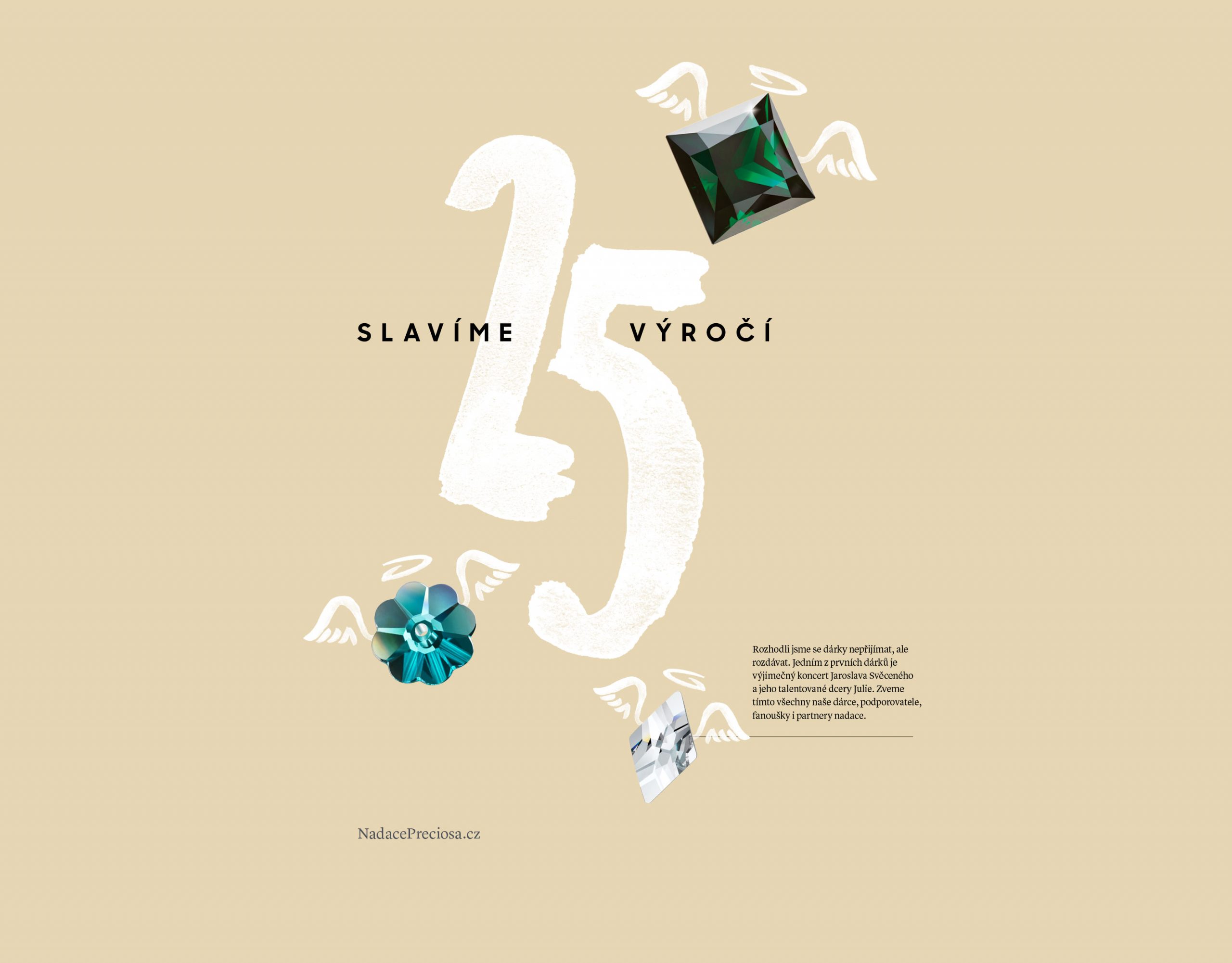
Preciosa Foundation visual identity—Marking their 25th anniversary, Preciosa Foundation needed a strong new identity that reflects their unique spirit. Preciosa Foundation is different from other non-profits becuase it is funded mainly by the parent company Preciosa, world-renowned crystal producer. The identity is designed to provide a strong link to the creativity and hand-made craft associated with Preciosa.
SCOPE
Branding strategy
Visual identity
Verbal identity
Brand communication
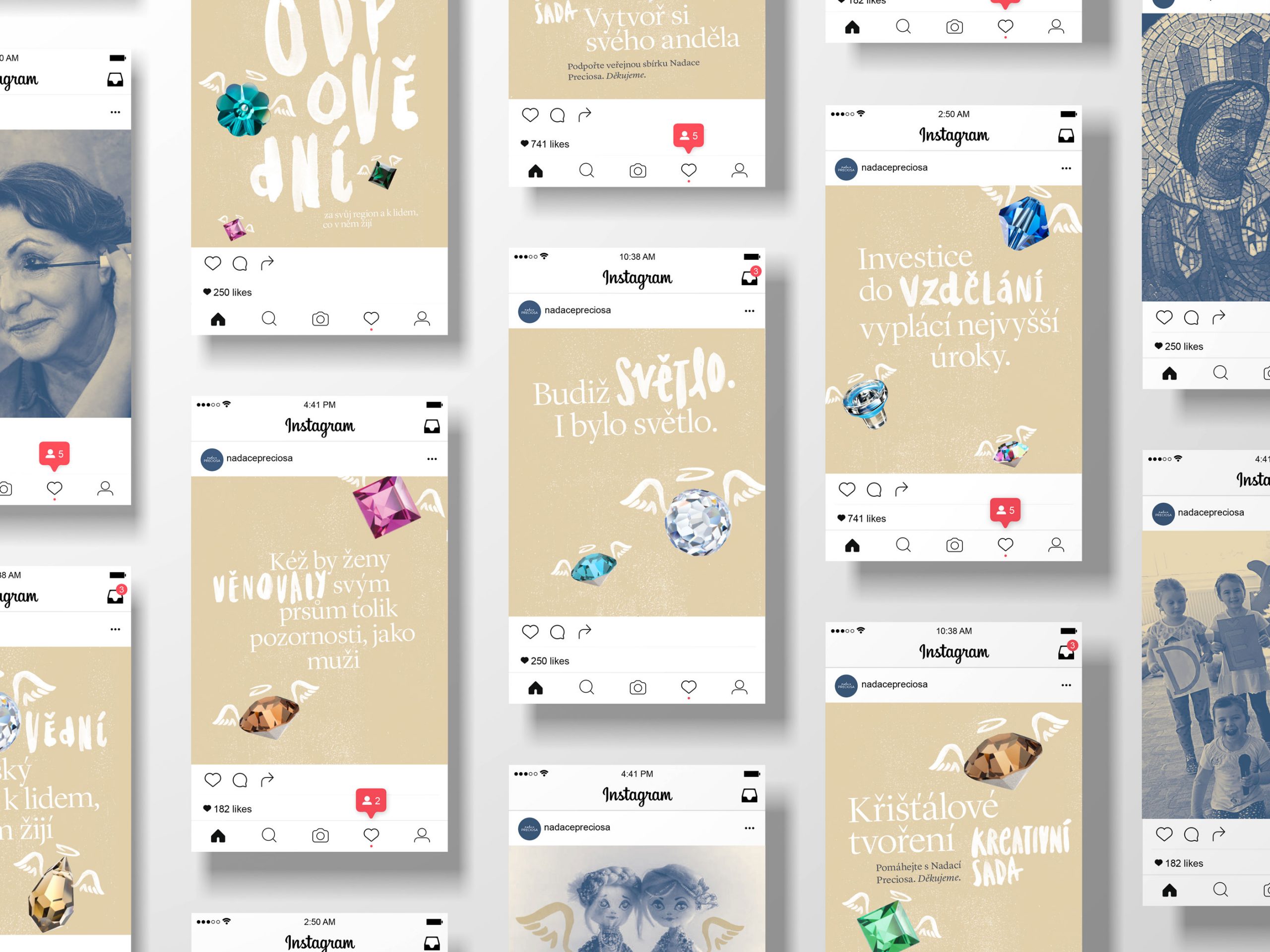
Social media branding
Print promo materials
Event branding
CONCEPT
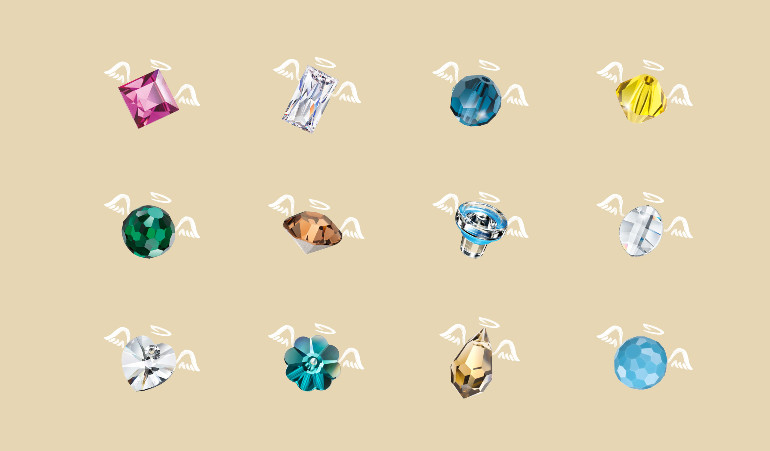
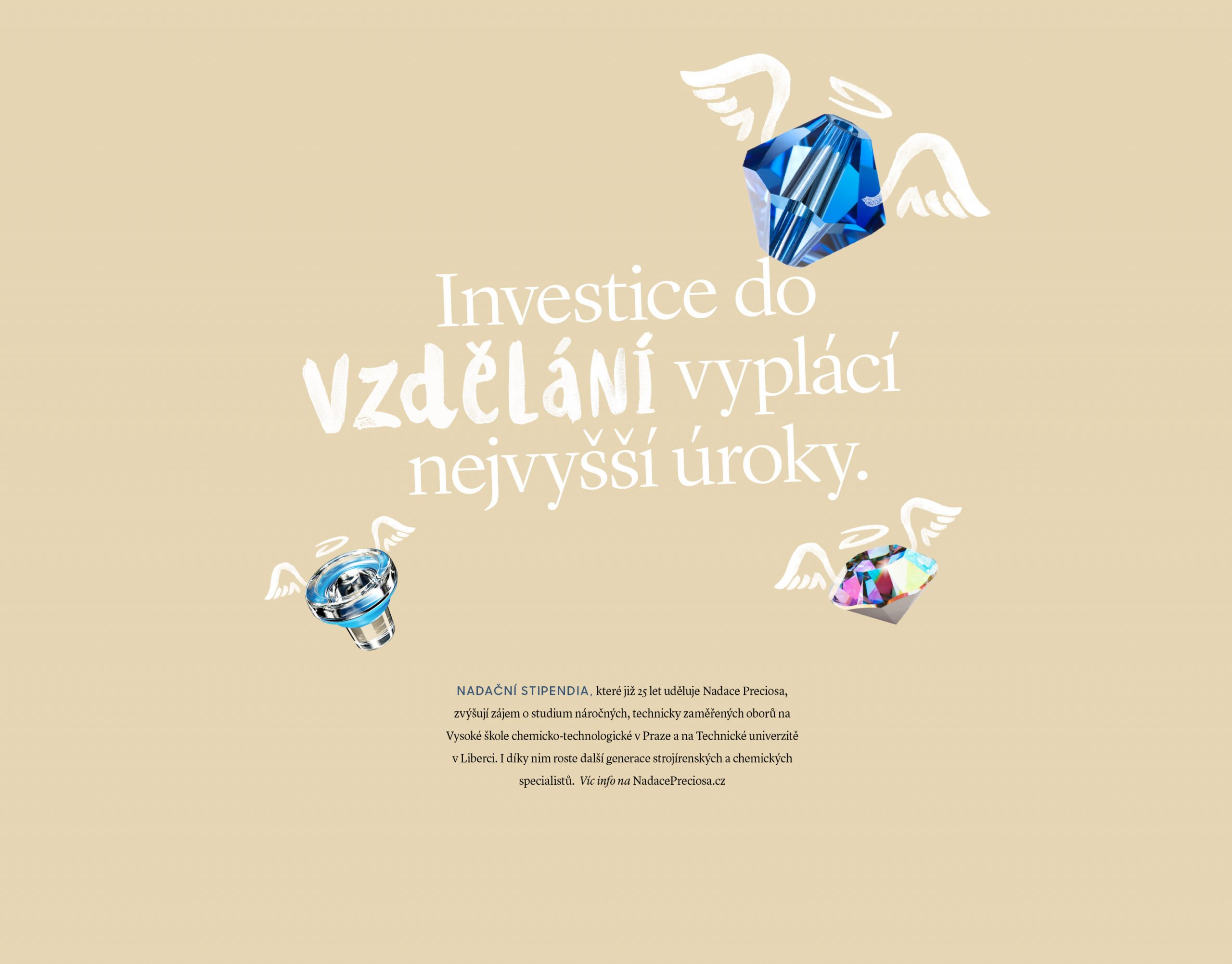
Preciosa angels—The first distinctive element of the new identity are so called Preciosa Angels. These visuals are actual products of Preciosa's seven divisions crystal components, lighting, glass beads and glass closures enhanced with a hand-drawn angel wings and halo. This fairytale approach is a reflection of the myths and rich history of the Crystal Valley, name given to Northern Bohemia where glassworks of Preciosa have been in operation for over four centuries.

Guidelines on corporate typography
IDENTITY ELEMENT
Unique typography—The second defining element of the identity is a unique typographic approch. Corporate fonts were taken over from the corporate identity of the parent company. An additional handwritten font was added to higlight keywords in the headlines. This typograhic approach provided a strong link and continuity with the Preciosa materials while creating a much less corporate feel.
Examples of identity application

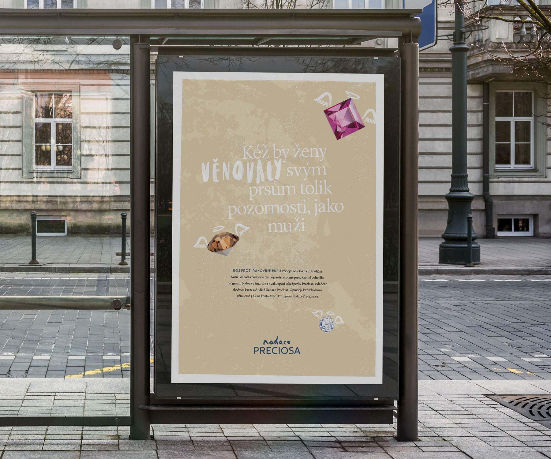
Citilight poster
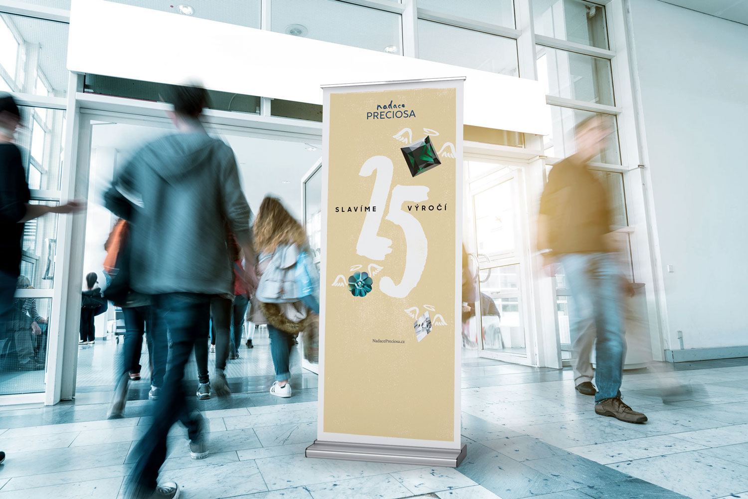
Application of identity on a promo rollup
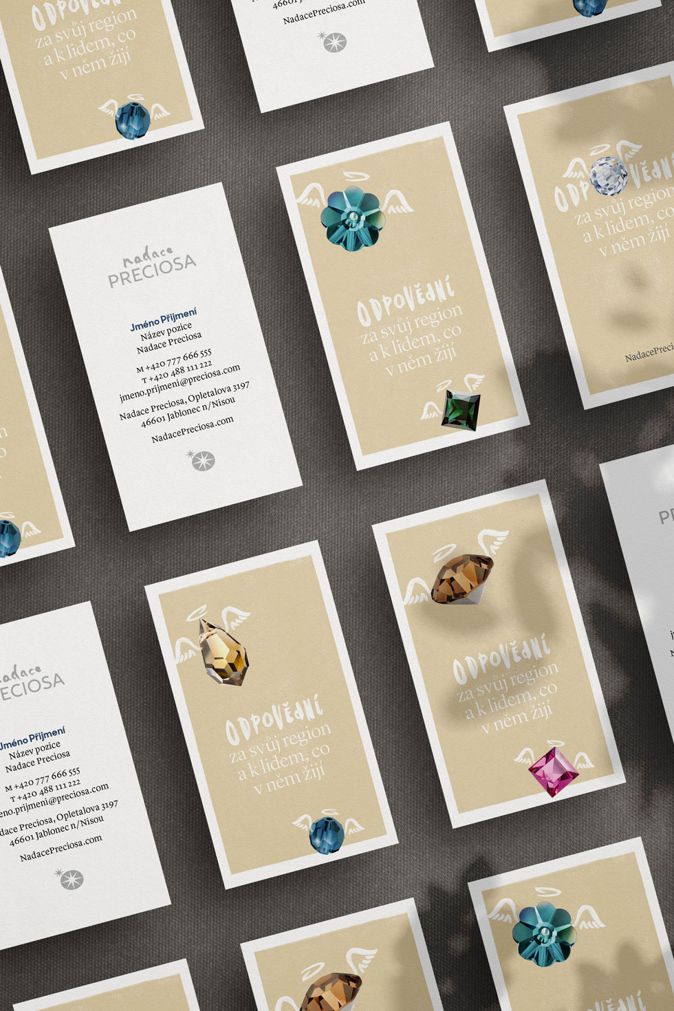
Business cards with alternating backside motives
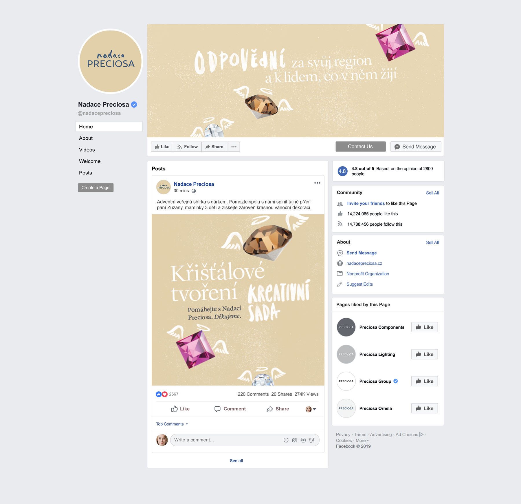
Branding of social media channels
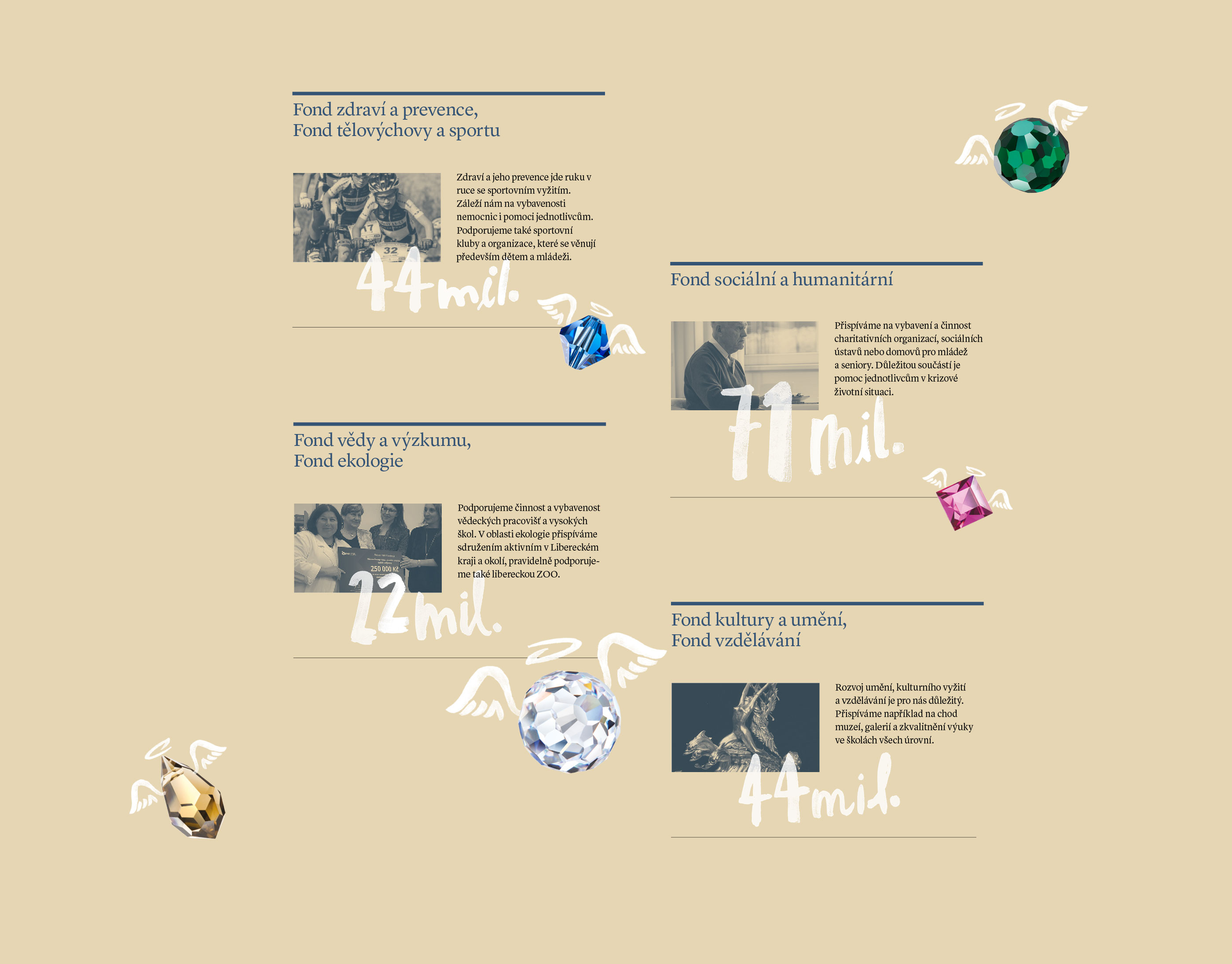
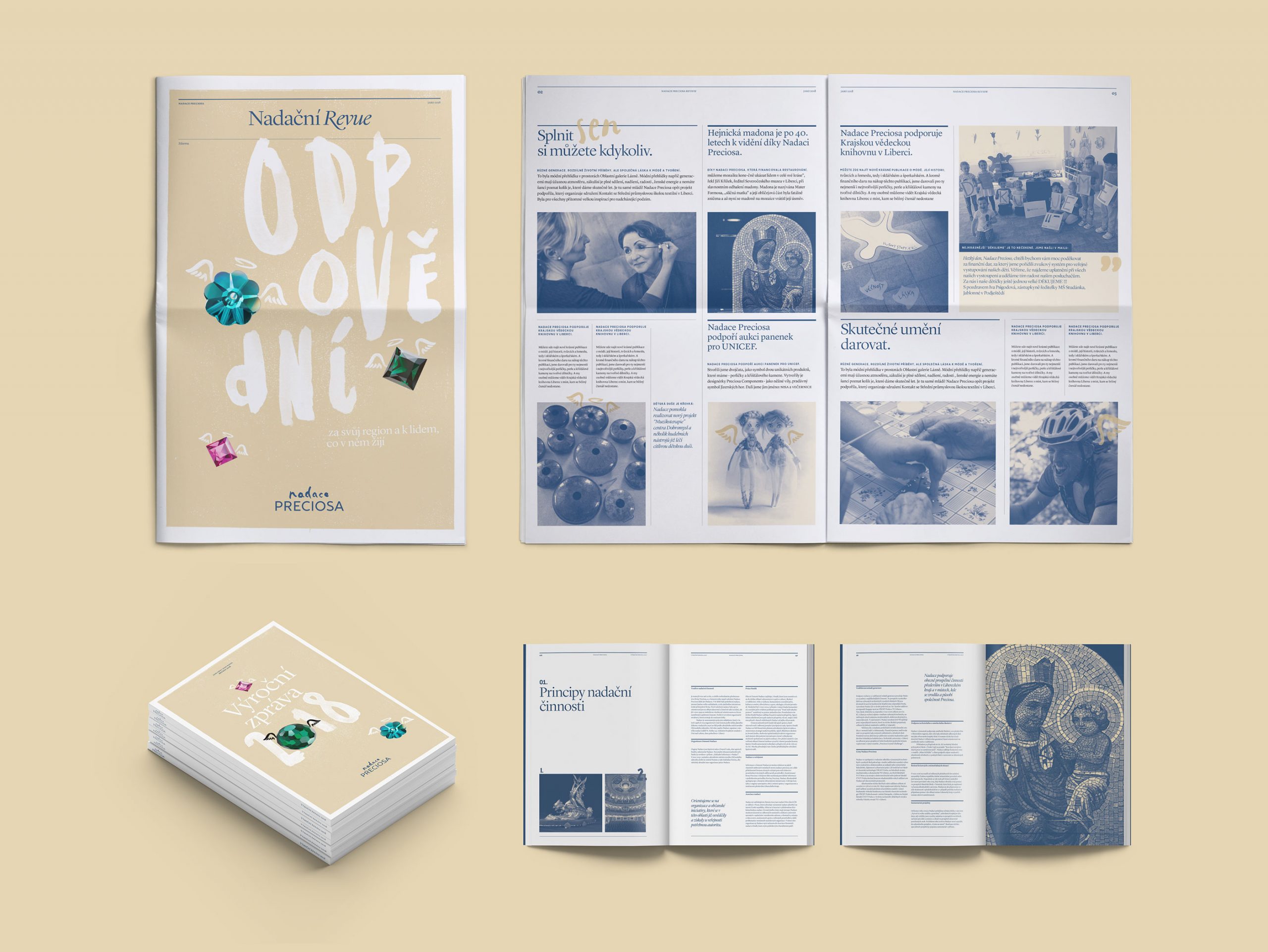
Annual report and company newspapers designed in the new visual idenity
The logo was prepared in two languages – czech and english.
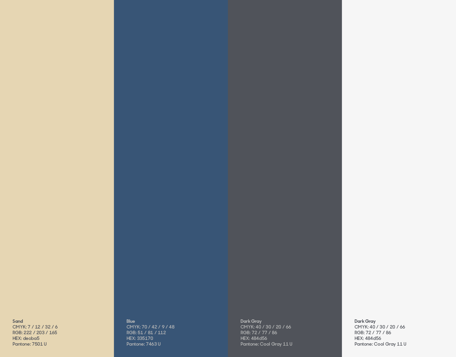
Corporate colours reflect the identity of the parent company.
The foundation‘s logotype is used by many third parties. Therefore the usage guidelines were carefuly crafted so the logotype is reproduced correctly in online and offline.
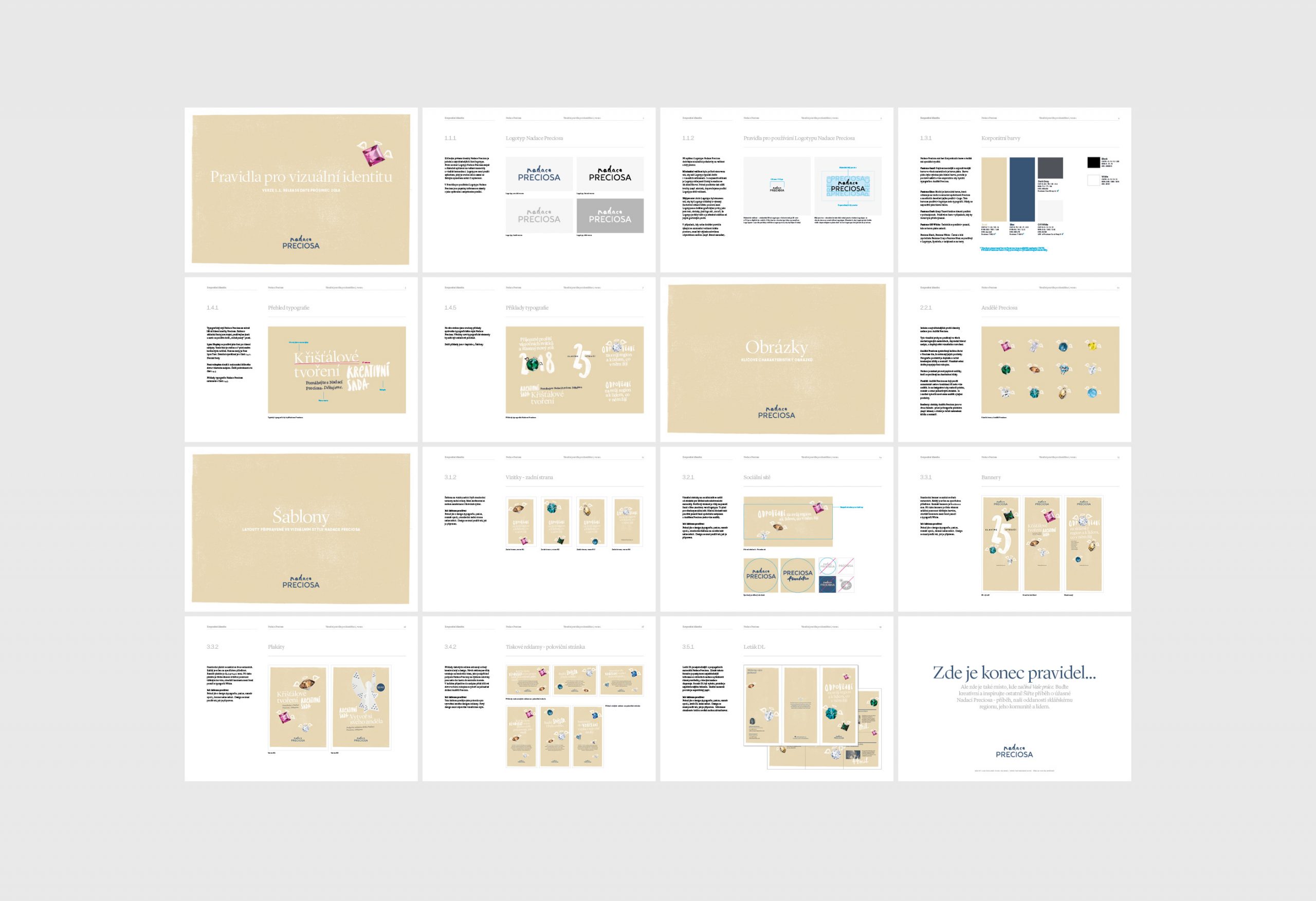
The identity was deliveded via easy-to-use design guidelines.
If you want to achieve
the full potential of your
brand—get in Touch.
STUDIO
Touch Branding
Drtinova 557/8 (level 1)
150 00 Praha 5 – Anděl
Czech Republic
Show map
CONTACT
New Business
info@touchbranding.com
Job Opportunities
jobs@touchbranding.com